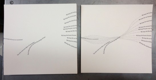
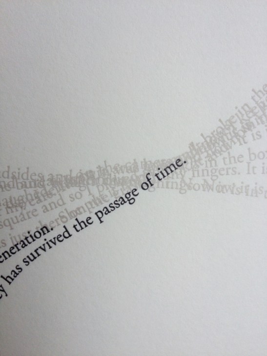
Gray ink, you look pretty nice.
 Hot damn, I am back on the press. Today I selected a warm gray with the help of my trusty Pantone mixing guide. I need a gray for the second color of text in the first part of the book. A simple thinned out black never really looks very nice to me. Adding a little red gives it some depth and makes it look more like a deliberate choice and less like an inking mistake or a default. After all of my ink trouble with the half frozen black 10850 ink, my transparent white (mixed with a tiny bit of pantone black and warm red) was a dream to print with. That can miraculously survived the journey to England without ill effect, I think it is because it was the only one that was brand new, full to the brim and topped with plastic.
The Ink Spot Press studio was mostly empty today, so I was able to monopolize the only table and lay out the folios I have slowly cranked out over the last few weeks. All that black text, just waiting for some gray.
 Once the color was selected, there was nothing to do but get down to it. Mix up the ink, ink up the press, check this, fiddle with that, adjust here, and bing bang boom, we are up and running.
 I did three runs today. All the text is now printed on the three folios that have a combination of gray and black text. After all of the agonizing I did while printing the black text, today’s activities went as smoothly as I ever could have wanted, and thank god. An easy and successful press run is the best thing for gaining momentum when there is a lot of printing ahead. Next week I start on the images.

 That’s it from Big Jump tonight. Over and out.


“…has survived the passage of time…” that phrase certainly has a resonance to it. Can’t wait to see what else comes along….
Sweet little press. Flatbush be jealous.