Beige Letter Day
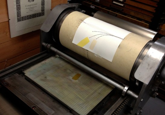
 Today was all about corks and clothespins. I completed four runs, two runs of each color, one for the text portion of the book and one for the appendix. It is important to me to get a close-ish match on the colors of the objects for this book. I mixed the pantone colors according to the guide and then tinkered with the result until I was satisfied.
 I, Big Jump Press, hereby promise that these Pantone photos will stop eventually. Despite all of my efforts to mix two subtly distinct colors (only one of them is visible on the guide above) for the two objects, they do look very similar. I am hoping that the slight difference will register.
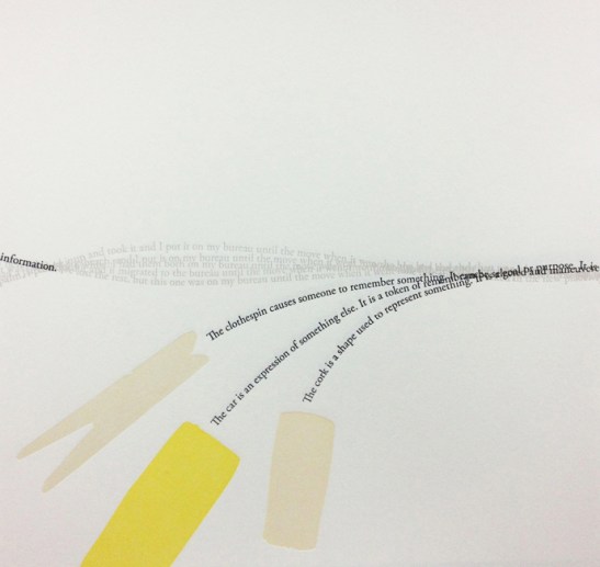
 I have been planning to layer black halftone images of the objects in the book over these color silhouettes (see below,) but at this stage I am considering leaving them the way they are as simple fields of color. The halftones will appear later in the book, and I like the simplicity of this folio. I may reconsider after I have printed all of these pages of silhouettes.

Digital draft of the design, including halftone images. Too much? The halftones with the color will feature later, and I may want to save it rather than give the game away.
It felt good to spend the day on the press today, four runs done feels like an accomplishment after many two-run days. After I finish a run, I always print seven to ten proofs to help me register the next run. This will be helpful particularly if I decide to print that halftone on top. It is good to have a map to help you get everything in line before you start wasting sheets, and the proofs serve this purpose.
 There you have it! More printing tomorrow. I may break from beige and head to red!


I think you are right about the “map” I print for my own amusement and I have “discovered” that I need to write out what I want to achieve with my plates, with the paper and the order I need to do it in. The new insight is that I benefit when I write out the objectives thing a couple of times. Simples.
these look great! and if you are looking for opinions, i am quite partial to the color-only shapes, especially if the half-tone images will appear later. i enjoy color quite a bit. and i like when books give clues as i go, and not all the information all at once. also, you inspire me to make more books. and be a more precise printer in general. so there. and thank you.
Thanks, Laura! I am leaning that way more and more in terms of the color v. halftone debate. I agree that leaving some information out can make something more compelling in general. I am much more likely to return to a book when questions haven’t been answered. Can’t wait to see your new books, where do we go for photos?