Post #37: In which I set up a run
 The majority of the work in a press run happens before the real printing begins. The “makeready,” time spent setting up the run, is the most critical part of the process. Laziness during the makeready means a bad run and a bunch of bad runs mean a bad book. Nobody wants to print a bad book, so meticulous adjustments are made during this time to correct a number of factors, the most important of which are:
(1) Position (is the printed thing in the right place?)
(2) Registration (is the printed thing really really in the right place? Is it in the right place in relation to the things that are already printed in other colors?)
(3) Inking (is there enough ink? Is there too much ink? Is the ink the right color?)
(4) Impression (is the paper hitting hard enough to make a very slight bite in the paper? Is it hitting too hard so that it looks like a wedding invitation?)
Today I thought I would take you along on my makeready while I set up to print the first run on the title page of the new book. This could either be fascinating or unbelievably dull. Let’s find out!
The image above shows the page I used to put the polymer printing plate on the base. (To see how this is done, have a look here.) Once the printing plate is in the bed of the press, it is time to make small adjustments to the position. Below you can see (from left to right) a printout from the digital design showing an early draft of the title page, a proof showing the position of the objects in the appendix of the book, and finally, the first proof of the day showing the first impression from the plate that is now in the bed of the press.
Note: I do all the makeready on proof sheets, which may make the images in this post somewhat confusing. The only thing I am printing here is the gray rectangular thing and the gray sideways pine cone thing. All of the other stuff is leftover from earlier makeready.
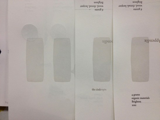
 Here I have noticed that my early design for the title page has the objects lining up in an arbitrary place on the page. Why not line them up in the same position as the objects in the appendix? (the middle sheet in the image above) This will make the design more cohesive, especially since I will re-use the title page design when I introduce the appendix later in the book.
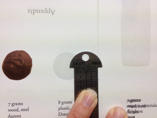 Using my pica ruler, I measure the distance between where the image is printing now (right) and where I want it to be printing (lined up with the objects in the appendix pages.)
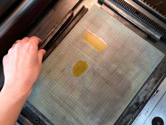 I add some ‘furniture’ in the bed of the press to move the plates lower so that the images will print lower on the page.
 Success! You can see how far the images have moved because I used the same sheet of paper to take a second proof. The lighter gray shadow is where the images are now printing, about two picas lower than where they were before. Now they line up respectably with the appendix objects (the cut-off round shape to the left.)
But wait a second. Now that I have moved them lower, they really should move more to the right so that they can line up more gracefully with the title. (The title is not printed here, but will fall where the word “appendix” is on the proof sheet above) I draw an arrow. If I don’t draw an arrow, I will forget what I am doing.
 Moving things to the left and right are easy on the press because all I have to do is adjust that side guide. (for a refresher on how the press works, have a look here.) Everything on the press is a mirror, so when the image needs to move one way, the side guide needs to move the other. I make the adjustment thanks to the trusty arrow that I drew before (remember that? I do) and I take a proof on the same paper as before so that I can easily gauge what the changes are.
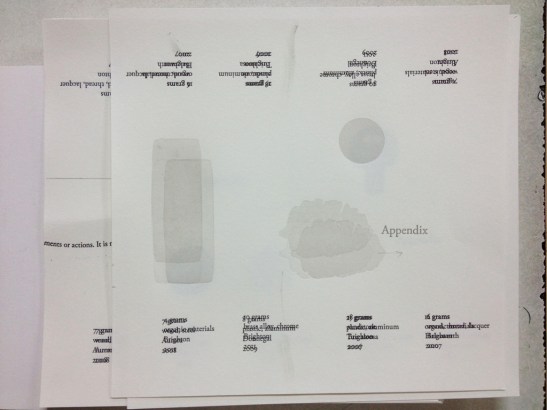 Success. The pine cone image is now much more snugly positioned under where the title will be. Can you see the new position? Now there are three of the rough upright rectangles (a silhouette of a toy car) and three of the sideways pine cones because they have gone through the press three times. The new one, the best one, is the one furthest to the right. Now that I am happy with the position I am going to have a closer look at the ink.
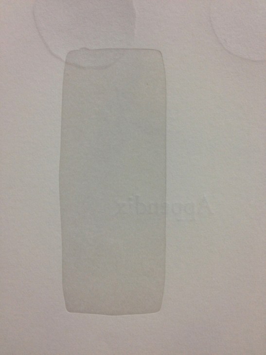 Not enough ink. Just look at it. All speckly. If anyone saw something this speckly in my book they would laugh at me and then blog about how bad my book is. I had better add more ink.
 I add more ink so that no one will laugh about me and say mean things in a blog, and then I take a second proof (the weird rectangle thing on the right.) It looks a bit better. I think I will lower the inking rollers a bit. That will smack some more ink on there for sure.
 Ok, rollers lower. Let’s have a look.
 mmmm, still needs more ink I think.
 AHA! perfecto! ok so where am I now? Oh, maybe I should look at the position again.
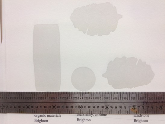 What the hell? How did that pine cone get way up there? I guess I was lazy before. Oh for god’s sake, now I have to move the plate.
 rrrrrg how annoying. Ok, now where is it? Let’s see.
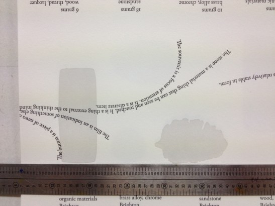 Well that is alright anyway. Maybe I will just take another proof and fold the page so I can see how it will look when it is in a book.
 Yeah, yeah, ok. ok. But I think it could use some more impression. Some people will find the following photo CONTROVERSIAL.
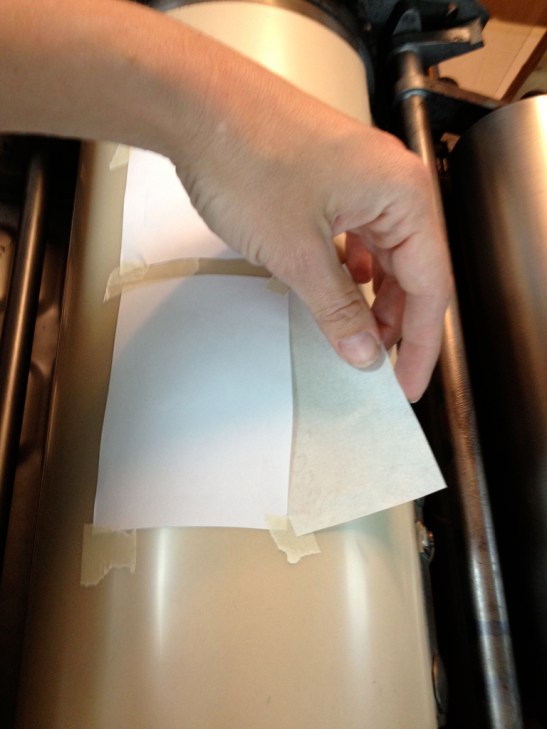 HA! Take that, purists! I am simply taping some paper and onionskin to the cylinder to increase the impression. I know I should get out the wrench and open the cylinder and put more paper under the tight drawsheet, but I am not going to. Not because I am lazy (really) but because I think a little soft packing on top makes the impression nicer. That all may have been less controversial and more geeky but I DON’T CARE. You’ve read this far, don’t give up now, we’re almost done!
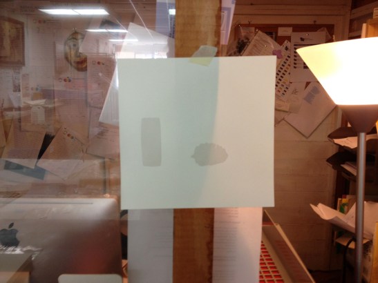 There! It is all perfect! Now I will print on a fresh new folio and tape it up in front of me to remind me what perfect is. If the inking gets light, I can compare it to the perfect sheet and add more ink. I can also check to make sure I don’t put too much ink on. It is important to keep the color consistent because the next run I am going to do is another gray run in the same color on the same page and I don’t want it to be obvious that it was done in two runs. Now I’ll get on with it and print.
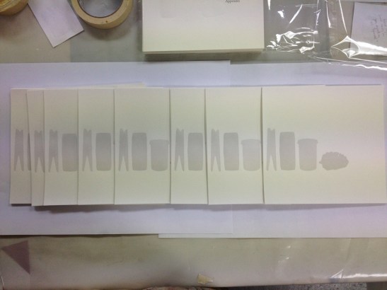
 BLAM!! NOW THERE ARE 85 OF THEM. Can you believe how fast the printing went after the makeready took so long? And now, just for satisfaction’s sake, you can see the title page sheets after I have set up for and printed the second gray run.
 Well done for hanging in there all the way through this grueling process. In my next post I will talk about proof sheets AND OFFER A SPECIAL PRIZE! Holy Cow.


I think you are as entertaining a writer as you are a perfectionist in your printing. I am impressed.