
Excavation #2: Point of View
I’m in Los Angeles in the middle of a visit to the Otis College of Art and Design this week to give a presentation at the Otis Book It Symposium and do some teaching. I gave a talk on the structural changes that take place between early concept drawings and final books. In gearing up for this talk, I’ve been looking back on old notes and sketches, finding images of mockups and revisiting old books. And what can you do but share this kind of stuff on your blog? So here we go.
I designed, printed and bound Point of View in 2008 as my thesis project for my masters degree from the University of Alabama Book Arts program. Initially envisioned as a dissection of different portions of a room, it became a rotating investigation of one position and moment in time. Four views of groupings of people from one spot are dissectable by peeling away layers of translucency. You can see a short video paging through this book here.
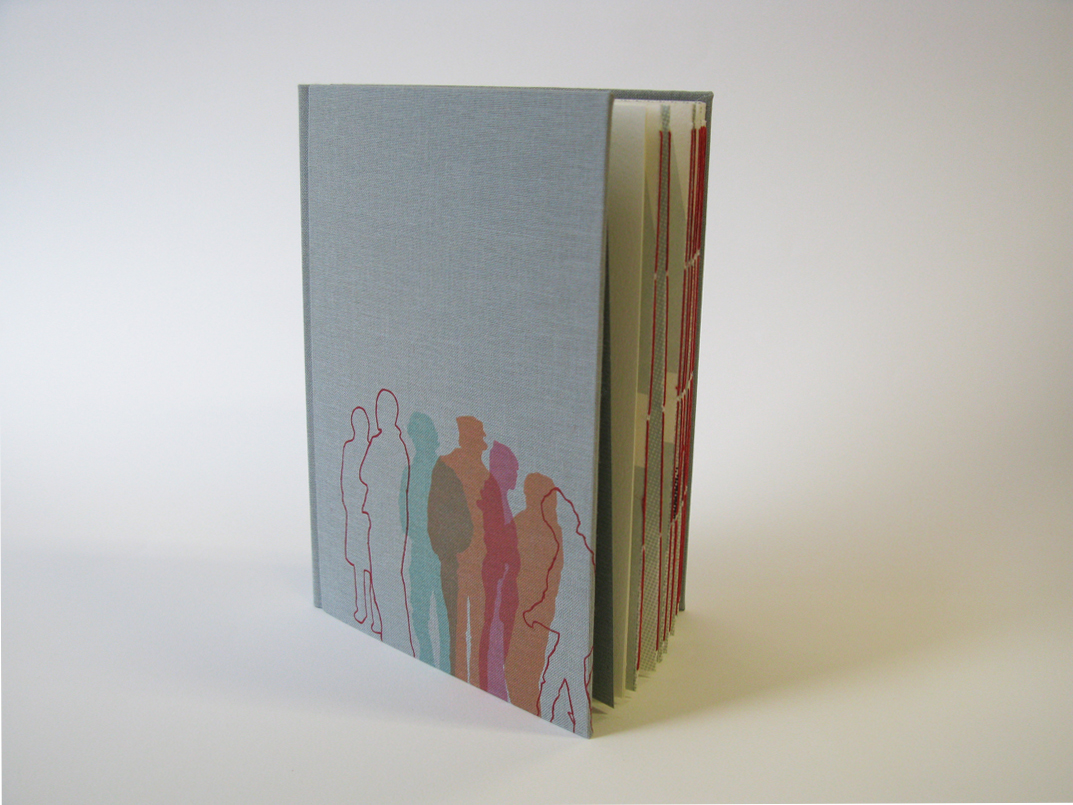

Over the course of its design, this book evolved from a rough and unfocused concept into an investigation of our compulsion to imagine the basic relationships of the strangers in our immediate surroundings. The couple (?) in the supermarket, the mother and daughter (?) on the street. Our perception of those connections at any given time can also be a snapshot of our anxieties. I finished the book in the fall of 2008 just after moving to New York State. Two years earlier, the project began with this quick digital sketch:
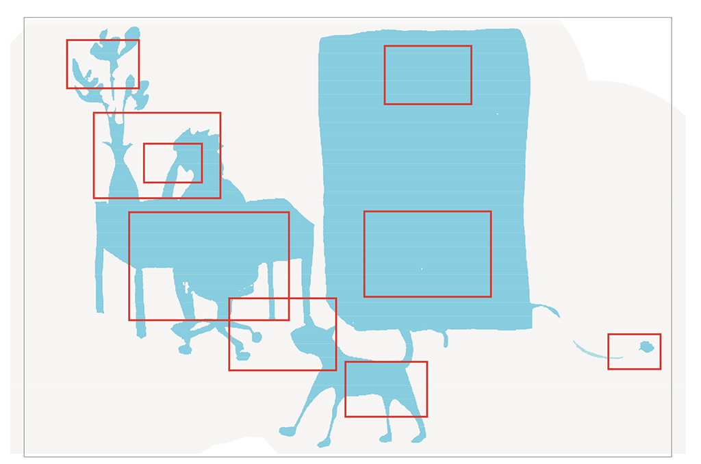
I initially envisioned the book simply as a dissection of a room. Red rectangles indicated areas that might be dissected in subsequent pages. There was much work to be done.
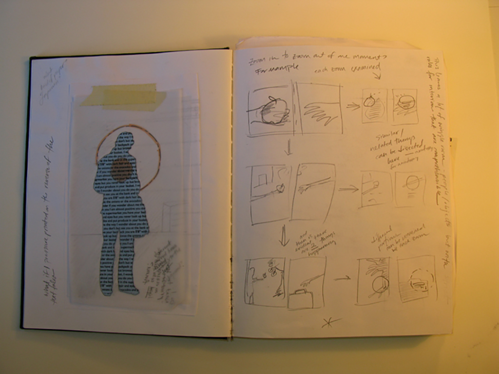
What to dissect? and how? The core of the book needed to be addressed before I could make any real progress, and so began a long process of drawing and experimenting with text and imagery. Do I retain the scale from page to page or zoom in? Do I dissect inanimate objects or people or both? Do layers of dissection include text? Will the dissections be straightforward and anatomical or reveal unexpected elements? Simultaneous to these fundamental issues issues of content, I needed to determine how to structure the binding of the book to facilitate a dissection. Do I move from page to page in a traditional way, each time revealing something new? Do I lift pages up like a clipboard? Do I employ translucency? Will the book be a codex? An accordion? Or something different altogether?
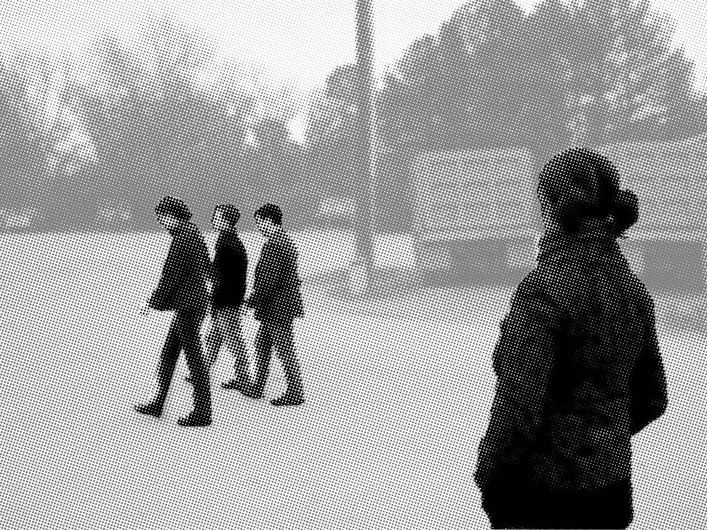
Early sketches and experiments with translucent material led me to the dissection plate, a series of layers printed with imagery that can be leafed through to pick apart a system. Dissection plates can describe complex anatomy, weather systems, population data, and many other diverse subjects. The plates I used to love as a child were sequences of translucency that I found in encyclopedias or old textbooks. Dissection plates need not be translucent, however. Here is a nice example of an anatomical plate, from Dr. Minder’s Anatomical Mannikin of the Female Human Body: an Illustrated Representation with Full and Descriptive Text. I began to make dissection plates out of drawings and old photographs.

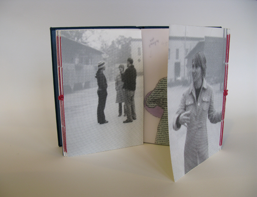
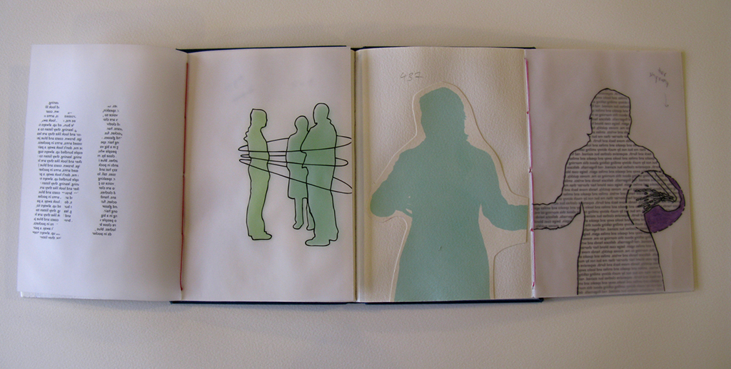
Mockups and sketches helped me refine my content and eventually led me to the gate fold, a series of pages that open like a set of french doors. Using the gate fold, I could present a spread with an printed photograph to be dissected. The viewer could investigate the environment in the photo by opening it up, revealing a folio of translucent material sewn into the fore edge of the book.

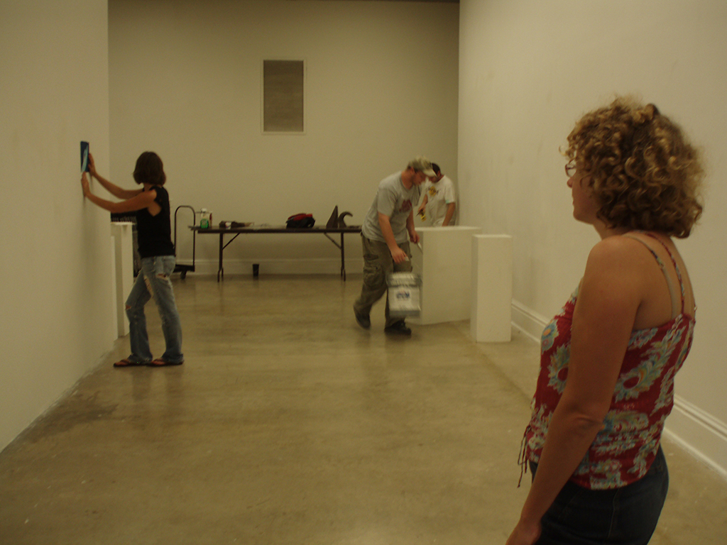
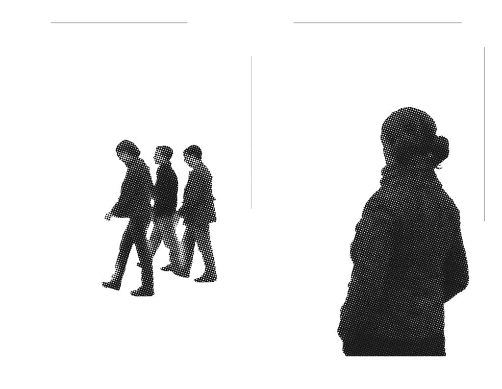
I needed imagery to work with before I could move forward. I had been using an assortment of old photographs as source material for early tests, but I needed to be more deliberate if I were to make a mockup in earnest. Friends of mine were hanging a show in a gallery nearby, and I used that opportunity to take some photos of figures in a relatively empty environment, thinking that I wanted to focus entirely on figures in a featureless space.
But the mockup that resulted was unsuccessful, partially due to this lack of environment.
Meanwhile, a structural problem with the gatefold was helping me to reframe the book. While working for me in one way, the gatefold had a drawback: the backsides of these dissected folios. What belonged there? The dissection couldn’t continue into this space. Below you can see some scribbled attempts at a solution.

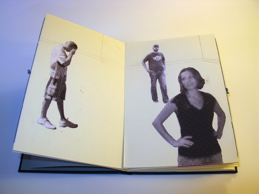
The solution I settled on was simple and also presented a basic solution to other problems with the book. The backsides of these folios would be a map. The environments to be dissected: four views from one location on this map, rotating 90 degrees between each image. Red points on the map would indicate positions of individuals to be dissected in the spread to follow. Below we’ll flash forward in time briefly to an image of the finished book:

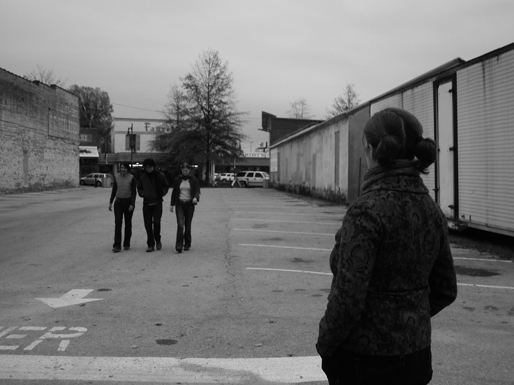
With this new plan in mind, I gathered some friends and met them in Northport, Alabama. I took dozens of photos from one spot, facing in four directions.
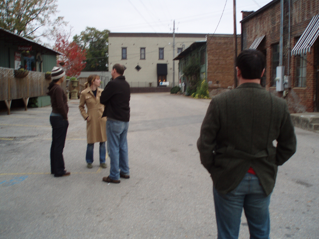

When the afternoon was over, I started to play with the imagery, thinking of each image as two halves of an scene that could be opened up.


I shifted between work on the computer, work in my sketchbook, and work on structural mockups.


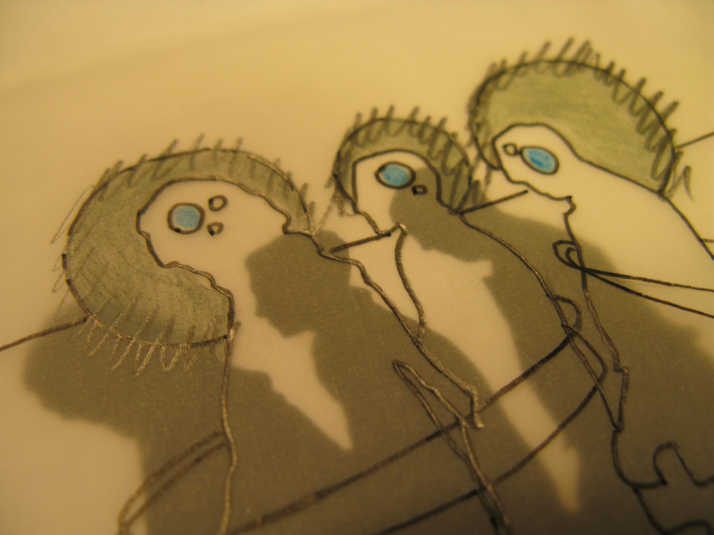
By this time I had moved to Upstate New York and was getting very close to concluding the design. The last great battle for this book was the treatment of text. Above you can see an attempt to create silhouettes entirely out of language. I eventually abandoned this track in favor of a small amount of text that indicated direct (printed in black) and overheard (printed in gray) dialogue. I also included punctuation used to indicate connection and missing information: ampersands, ellipses, brackets, hyphens and asterisks.
Of course once the design was finalized, the heavy work of printing and edition binding began. But that is another story for another day.
I produced this book in an edition of 100 copies. There are still a few available.
And now, back to Otis!
3 comments on “Excavation #2: Point of View”
Leave a comment


Reblogged this on libredelibro and commented:
Point of View (Punto de vista), brillante, pulcro, inspirador libro objeto de Sarah Bryant fue presentado como tesis universitaria pero es una delicia para reflexionar sobre la narratividad apoyada en la imagen y el diseño editorial… un punto sobre el cual volver, volver, volver…
Muchas gracias por sus amables palabras! Y perdona mi google español. Mis mejores deseos, Sarah
Thanks to you. I love your work. I will love to send you some books from Manofalsa. Please write to me to madrepora@hotmail.com. À bientôt!