
How to build a Greek typeface, by Eric Gill
What better way to celebrate being back in the UK than another post about the Monotype archive in Salfords? A few months ago, Monotype designer Toshi Omagari was kind enough to show me Eric Gill’s original drawings for Perpetua Greek from 1929.

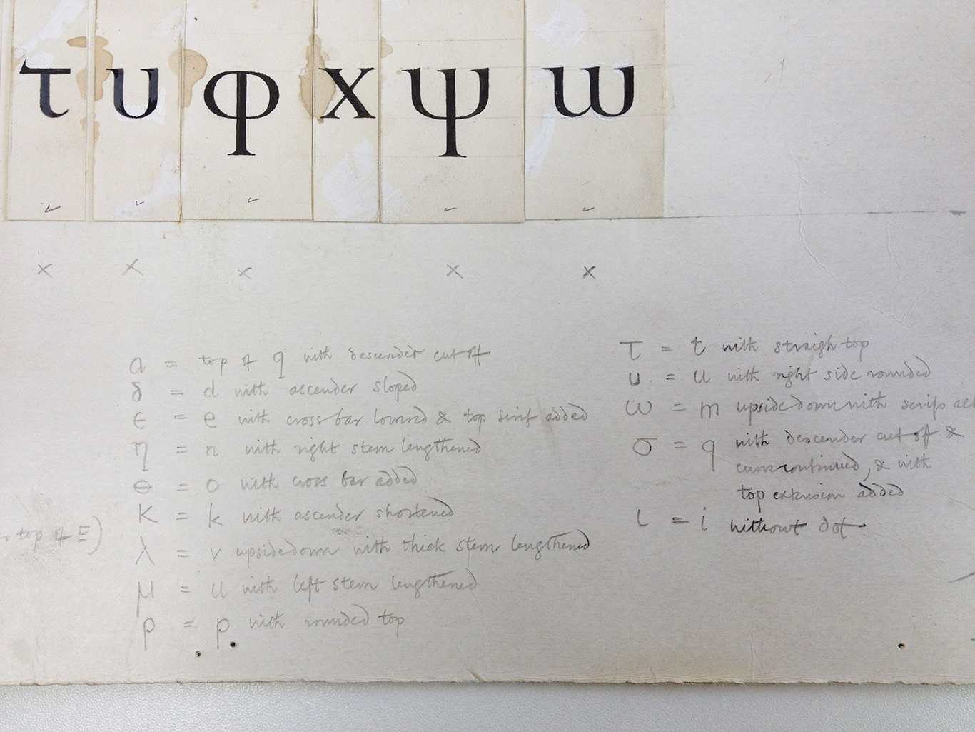
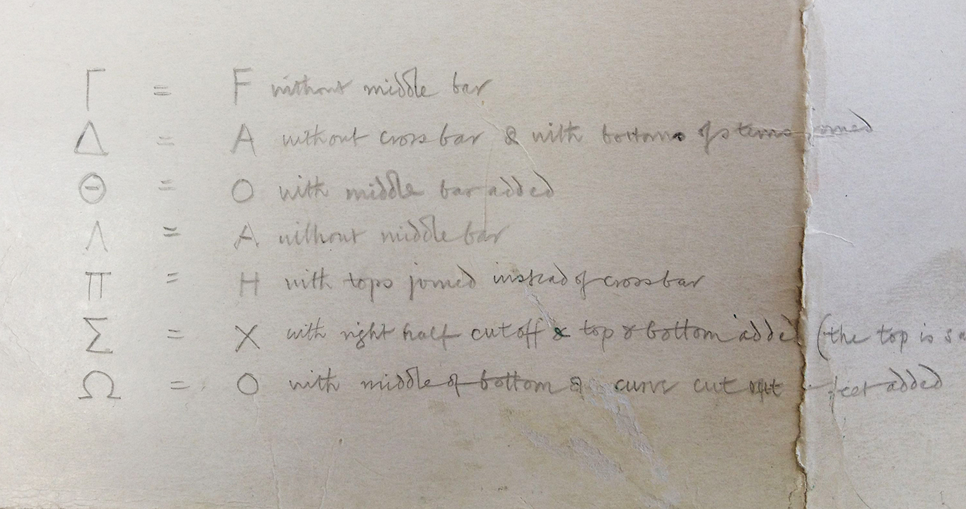
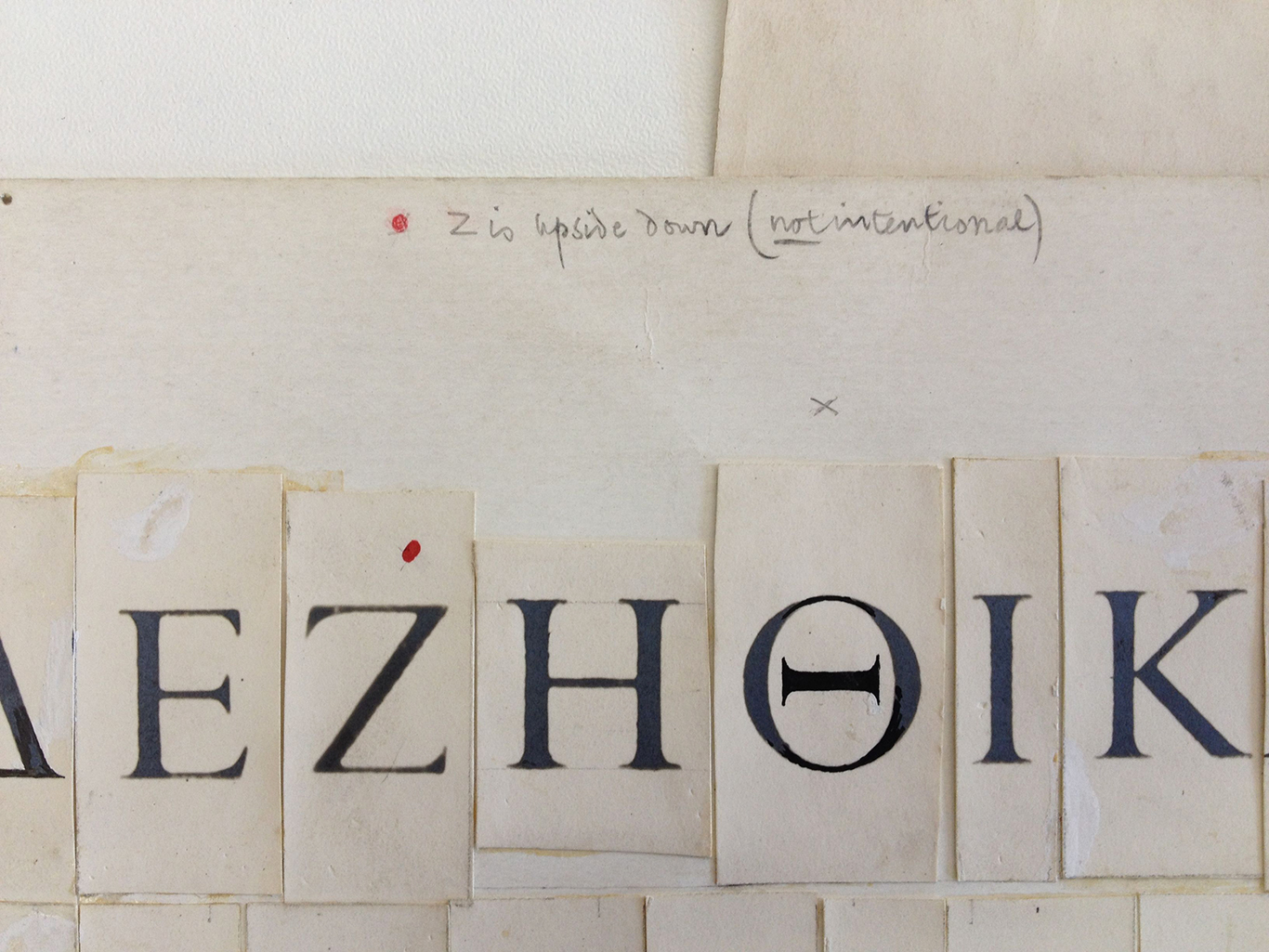
Perhaps what is most interesting about these drawings are Gill’s detailed instructions on how to build a Greek alphabet simply by adapting or converting Latin letterforms. δ (delta) is simply a “d with ascender sloped.” ε (epsilon) is an “e with cross bar lowered & top serif added.” ι (iota) is “i without dot.” And so on. Gill’s simple equations are examples of Latinisation, a touchy issue among type designers.
In defining Latinisation I turn directly to my type designer friend Ben Mitchell, who recently investigated the issue in his blog:
For the uninitiated, Latinisation occurs when designers take the familiar As Bs and Cs used in English (and other languages) as their point of reference in designing other writing systems. The Latin script has undergone much evolution over the centuries, and its rich typographic heritage can easily spill over onto writing systems with different conventions. This overspill could amount to the borrowing of stylistic details like serifs, copy-pasting the same arches between different scripts, or even reappropriating entire letters. In a less obvious sense, it can also amount to the way a typographic family is set up with bold and italic styles being propagated onto scripts where they are alien, or re-proportioning a script to work in typographic environments that were set up to accommodate Latin.
I chose to post these images of Perpetua Greek today because Ben has just written a fascinating post about Latinisation in Thai type design. If you like looking at Eric Gill’s instructions for Perpetua Greek, boy oh boy will you enjoy reading about looped and non-looped Thai type styles. Ben again: “Latinisation is a central discussion for type designers working on Thai, and a vexed, emotive one with complex, overlapping issues that cannot easily be teased apart. I’m not aiming to draw conclusions, but to offer observations and opinions that might prompt more discussion or open new lines of enquiry.” Want to read more?
While I go and re-read Ben’s post I’ll turn the rest of this one over to Eric Gill, who is eager to teach you how to do a little Latinising.


All images courtesy of the Monotype Archive in Salfords. Thanks again, Toshi, for generously sharing the archive with me all those months ago. Now back to digging out my inbox, going through my mail, unpacking the bindery and getting back on the press! More soon.
2 comments on “How to build a Greek typeface, by Eric Gill”
Leave a comment


OK it’s fascinating and all, to see how Gill thought about this. But the lower-case letters in that font are horrible.
*Classicist alert*
First, there are plenty of Greek fonts you could reference: ancient Greek manuscripts, modern printed or hand-written Greek. Why would you start from Latin forms, given that you are only going to use this font to write Greek?
Second, when you learn to write Greek (which I had to do back before the Peloponnesian War when I was at school), you *don’t* just use the nearest handy Latin form. A gamma is not a y; a rho is not a p. Why reverse that and just grab the nearest handy Latin form? What is the benefit?
Third, some of those letter-forms are just ugly (IMHO etc etc)! That eta with the clunky serif on the descender; the oddly-Celtic epsilon; the nu that’s just a v.
I’m going to have to make a nice cup of tea and calm down.
Su
Hi Su! Yes! Those are core Latinisation issues! I will also have a cup of tea now. You got me worked up.