
Adventures in the Monotype Archive: Jan van Krimpen’s Angry letters

Welcome back to the Monotype Archive! Thanks to Monotype designer Toshi Omagari, I was able to spend time last week digging through boxes and pawing old documents and type drawings at the site of the former Monotype factory in Salfords. Last week I broke your hearts with the sad tale of Sachsenwald. This week we are turning our gaze to this stack of documents:
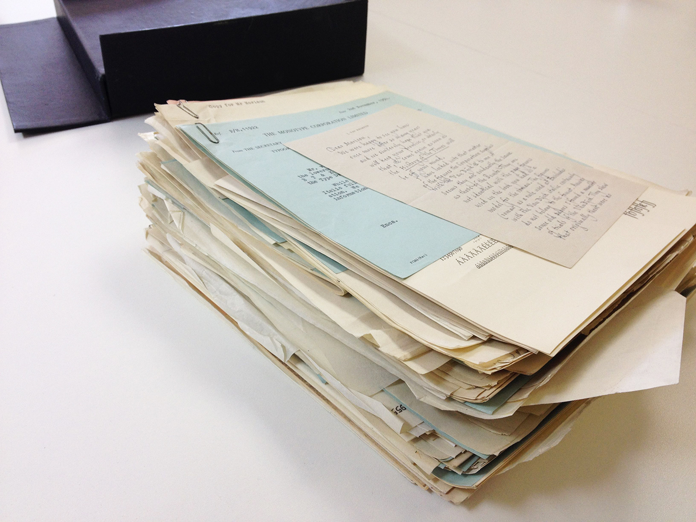
Here we find a collection of correspondence between Jan van Krimpen, Stanley Morison, and Geoffrey Paulson regarding the design and production of the typeface “Spectrum.” At the time these letters were written, between 1953 and 1956, van Krimpen was a designer for the Enschedé foundry in Haarlem, Stanley Morison was a typographic consultant for the Monotype Corporation, and Geoffrey Paulson was the Monotype Assistant General Manager for the Type Design Office, the point of contact for designers to communicate with the Monotype team that was translating their drawn designs into letterforms that could work with the Monotype casting system. Van Krimpen had designed Spectrum for Enschedé in 1952 for the Utrecht-based Spectrum publishing house and Monotype was gearing up for production.
A dry topic, you say? Ha! There are jewels to be found in these letters, insights into the daily back and forth of 20th century type design as well as hints of the deeply held beliefs about craftsmanship and production that were held by designers. Let us start in 1953 with a letter written on August 14th by Jan van Krimpen to Stanley Morrison.
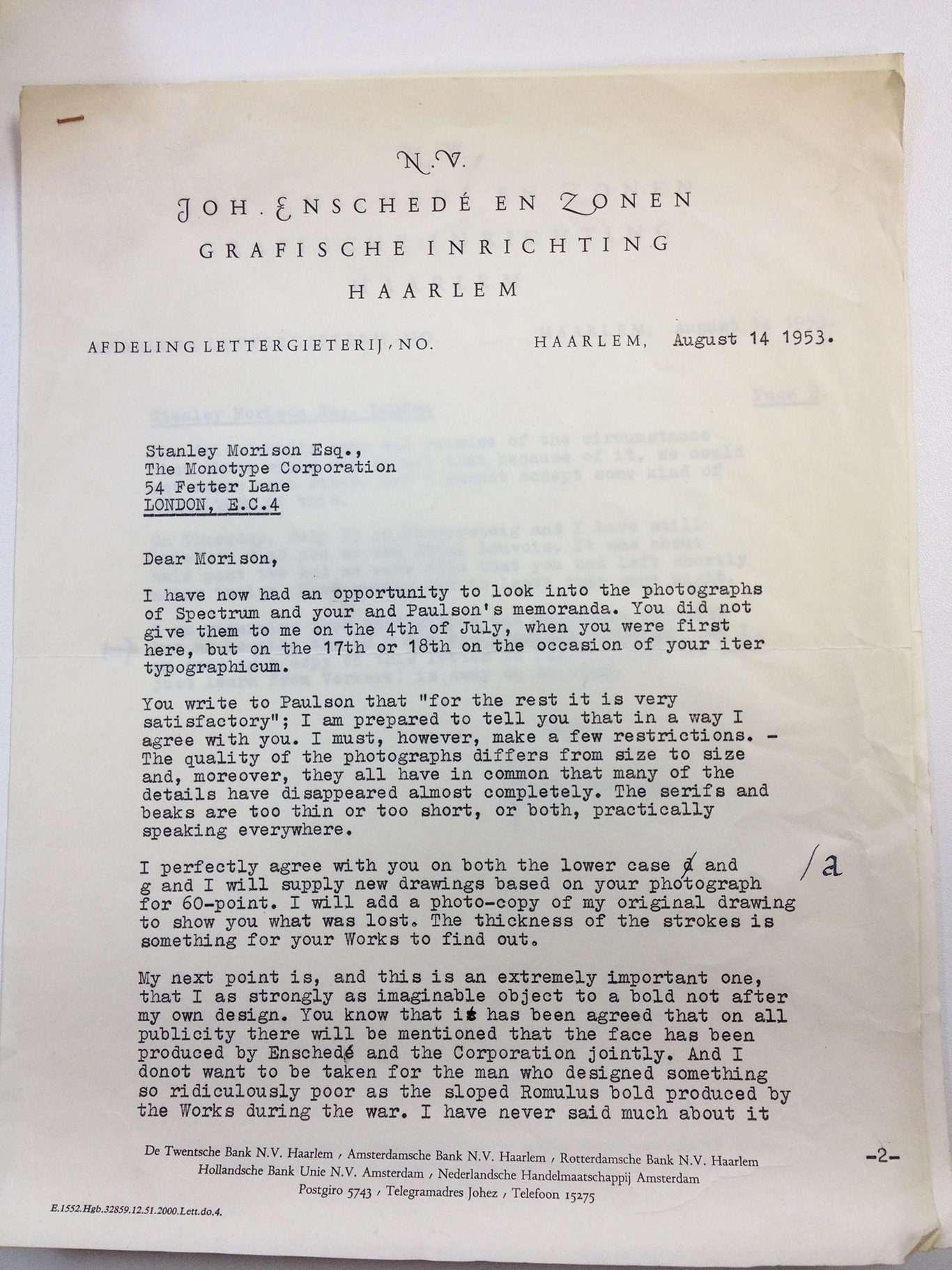
Whoa, whoa, wait, let’s look at the last paragraph on that page a little closer.

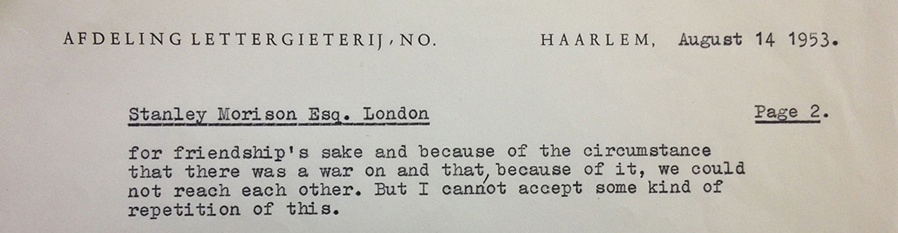
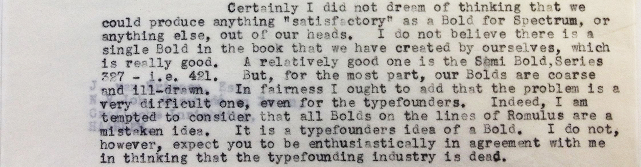
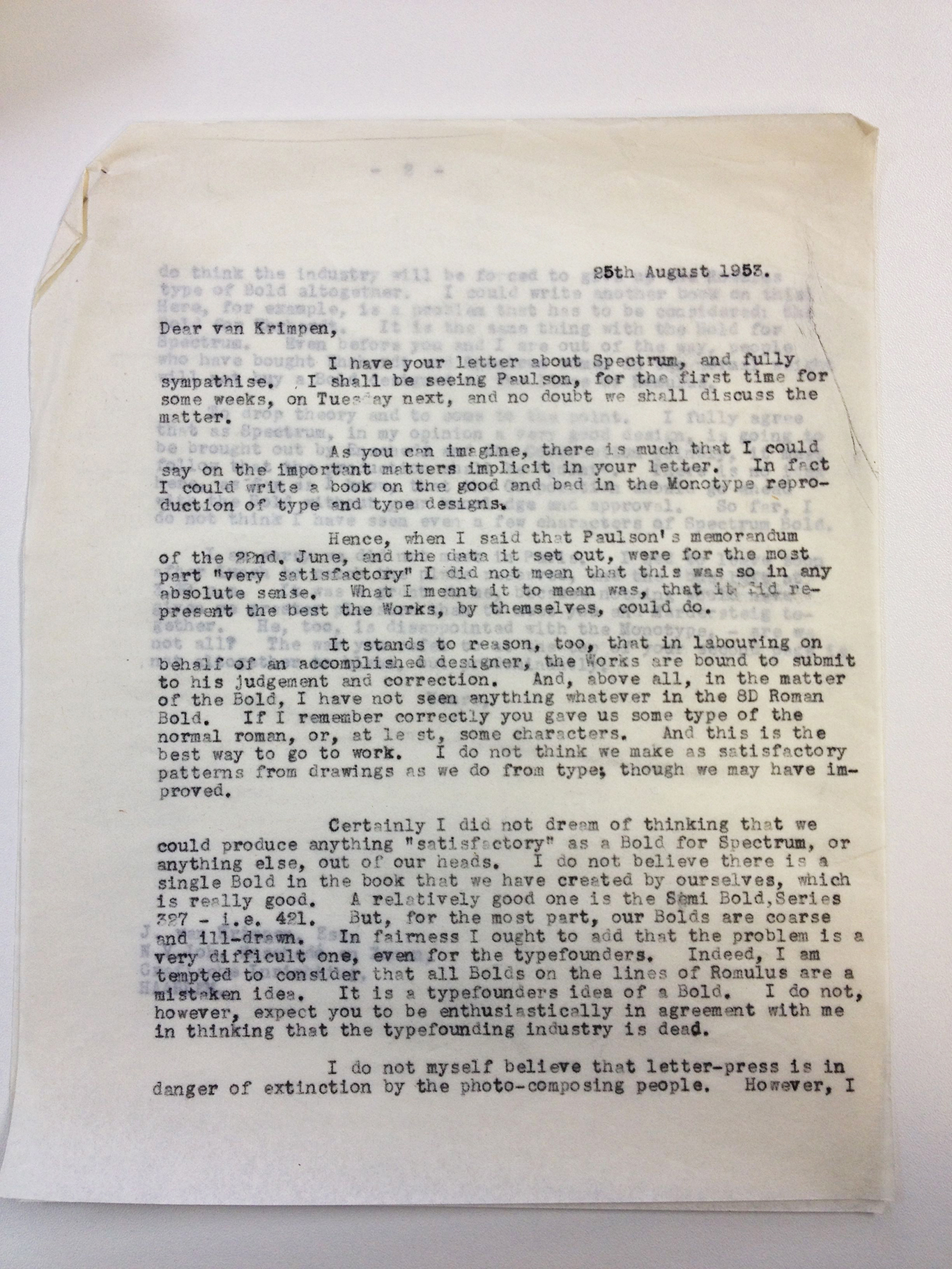
“I do not want to be taken for the man who designed something so ridiculously poor as the sloped Romulus bold produced by the Works during the war.” BURN. If you think that Stanley Morison is going to defend that sloped Romulus bold, you’ve got another thing coming. In a return letter dated August 25th, he states quite plainly that “I do not believe there is a single Bold in the book that we have created by ourselves, which is really good.. . . for the most part, our Bolds are coarse and ill-drawn. In fairness I ought to add that the problem is a very difficult one, even for the typefounders.” Have a look, here it is:
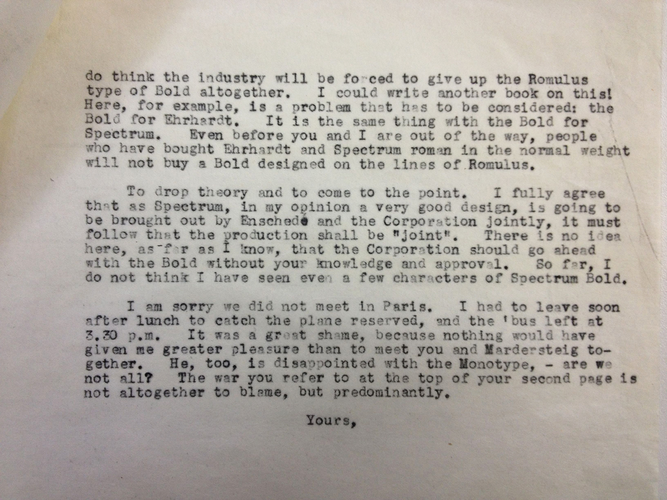
Morison’s letter is scattered with comments about the limitations of Monotype. Close to the end: “[Mardersteig], too, is disappointed with the Monotype. Are not we all?” He also touches on something that was looming ahead for everyone: the end of hot metal. “I do not myself believe that letter-press is in danger of extinction by the photo-composing people.” Well, we know how that turned out. I am including the complete letter at the bottom of this post, should you wish to read it.
In fact there were a number of issues at play with the Monotype translation of van Krimpen’s design. Firstly we have the mechanical constraints of the Monotype casting system, which I will describe in a moment. Issue number two: Disagreements between the Monotype drawing office and outside designers were common. Were the Monotype people making necessary changes to fit the Monotype system or were they forcing their own aesthetics onto the design? This was a constant source of debate for many designers, including van Krimpen. Another important piece of context is that during the time that these letters were going back and forth, Morison and van Krimpen had very different ideas about how an italic should look. Morison favored a sloped roman while van Krimpen believed in traditional cursive forms. Finally, I get the sense that van Krimpen was simply a difficult guy. Now this is a fun blog and not a scholarly essay, so I can include phrases like “I read somewhere that Beatrice Warde once said that van Krimpen was the most difficult designer that Monotype ever worked with.” Source? I don’t remember. Go find it. If you do, maybe I’ll write a scholarly essay one day.
On to the mechanical constraints I mentioned before: A key problem inherent in the translation of any original design into a Monotype design during this time period was the fact that pieces of type that were cast using Monotype equipment had to fall within a specific unit system. Each character had to have a “set width” made up of a certain number of those units. This put restrictions, however minute they might seem to you or me, on how each letter would fit together. Because there were only certain set widths that a piece of type could be, there was the potential for inelegant gaps between letter forms, a big problem for type and an even bigger problem for you if you are getting angry letters from Jan van Krimpen.
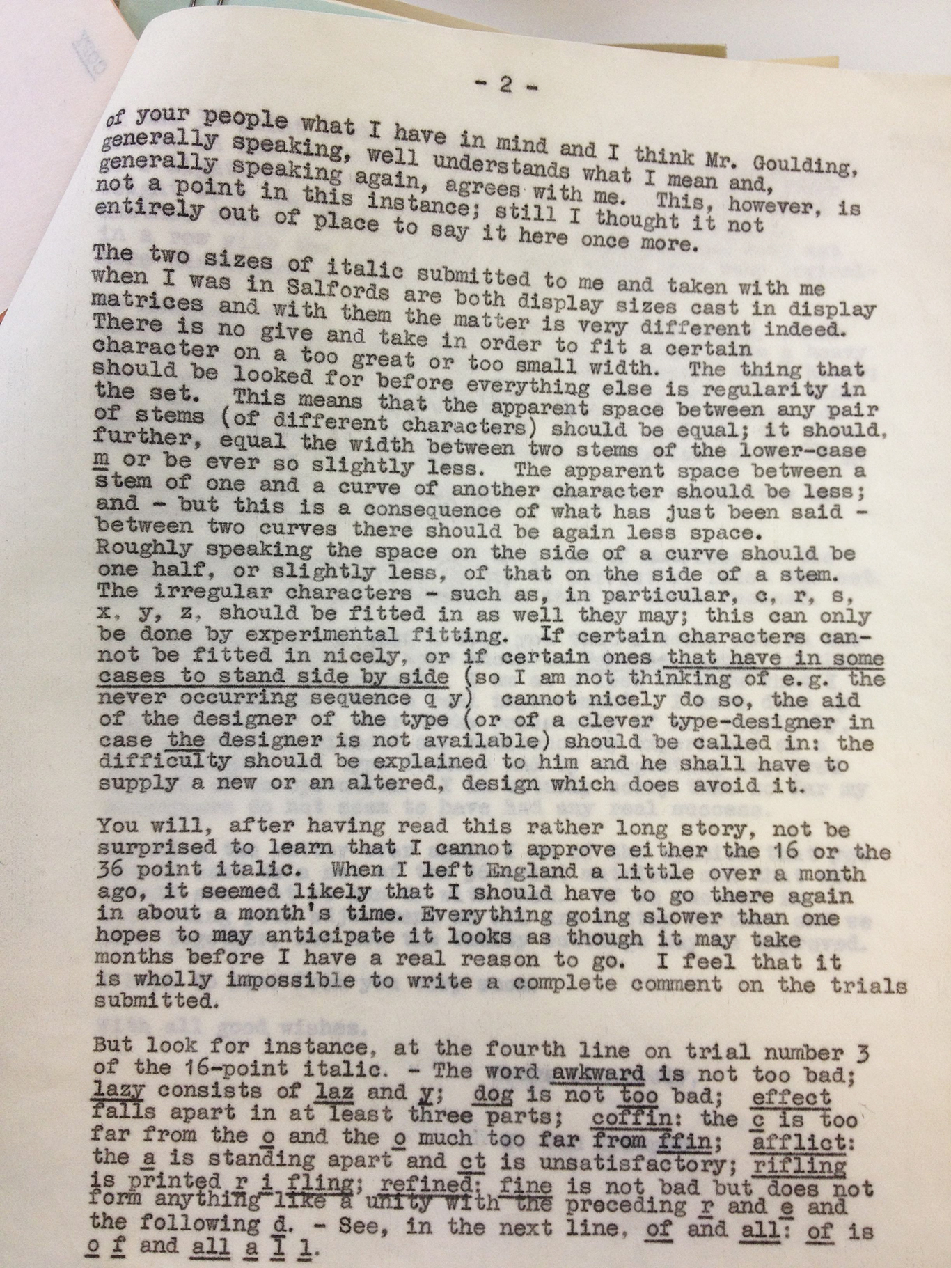
In that spirit, why don’t we investigate a series of letters written in December of 1954. (As she rubs her hands together with glee.) Boy oh boy was Jan van Krimpen unhappy about the “set,” or the spacing, of the Spectrum display italic! This letter was so grumpy that, look! It was forwarded straight on to Stanley Morison from Geoffrey Paulson.
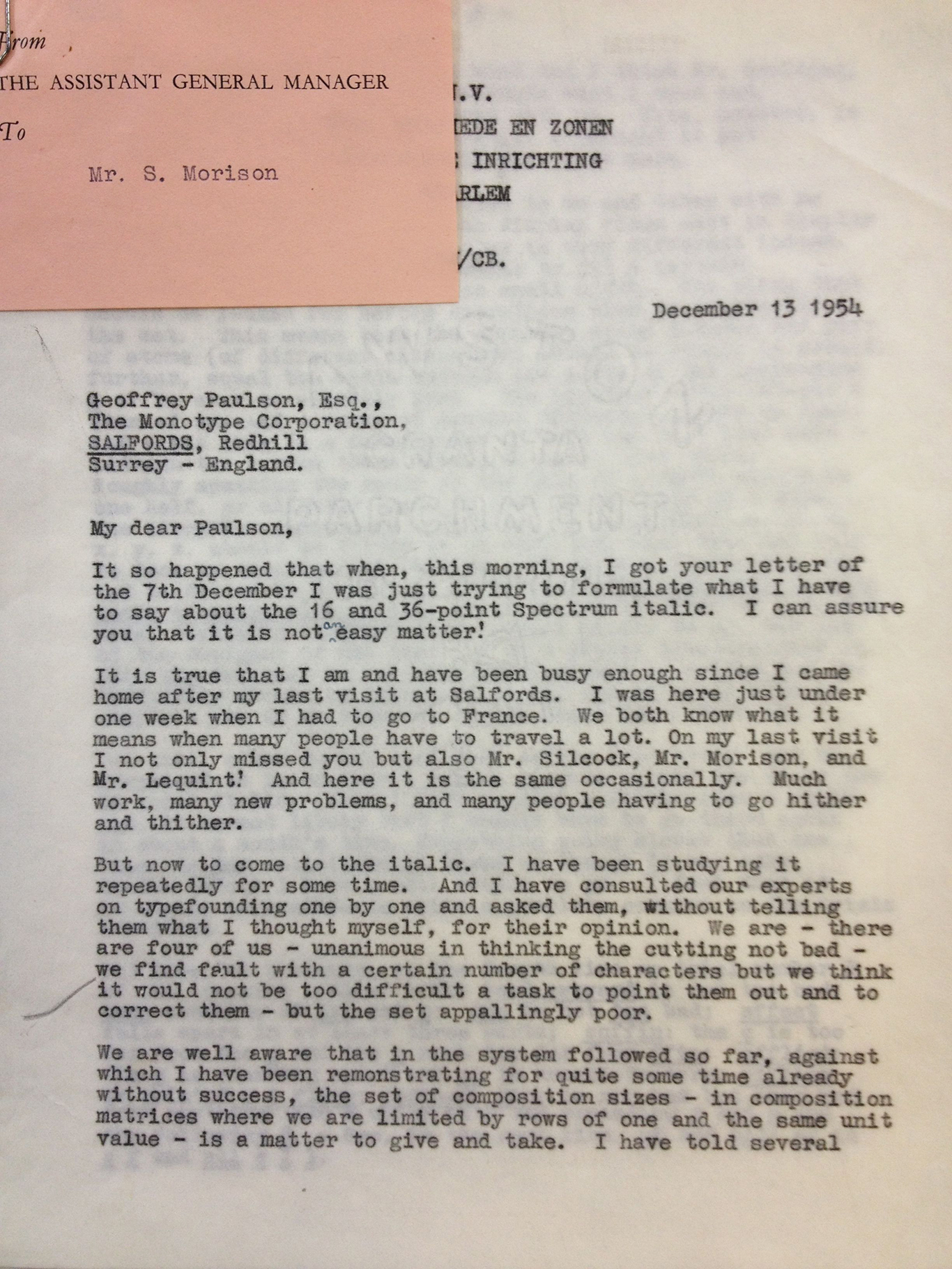
I know what you are thinking. How could an angry person send a letter so polite in its tone? This was the 1950’s and things were different then. Let’s have a look at what is making him so mad. Below he lists some of the more glaring problems in the 16 point type.

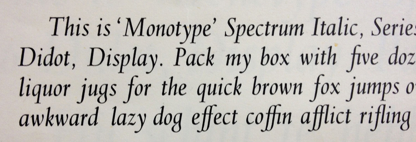
Below is a detail of the proof that van Krimpen had in his hand while typing this letter. (I apologize for the blurriness.) You can see for yourself the vast and unforgivable chasms between the “laz” and the “y,” and the “c” and “o” from the “ffin.” No wonder he sent such an absolutely charming angry letter.
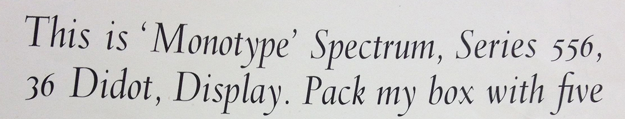
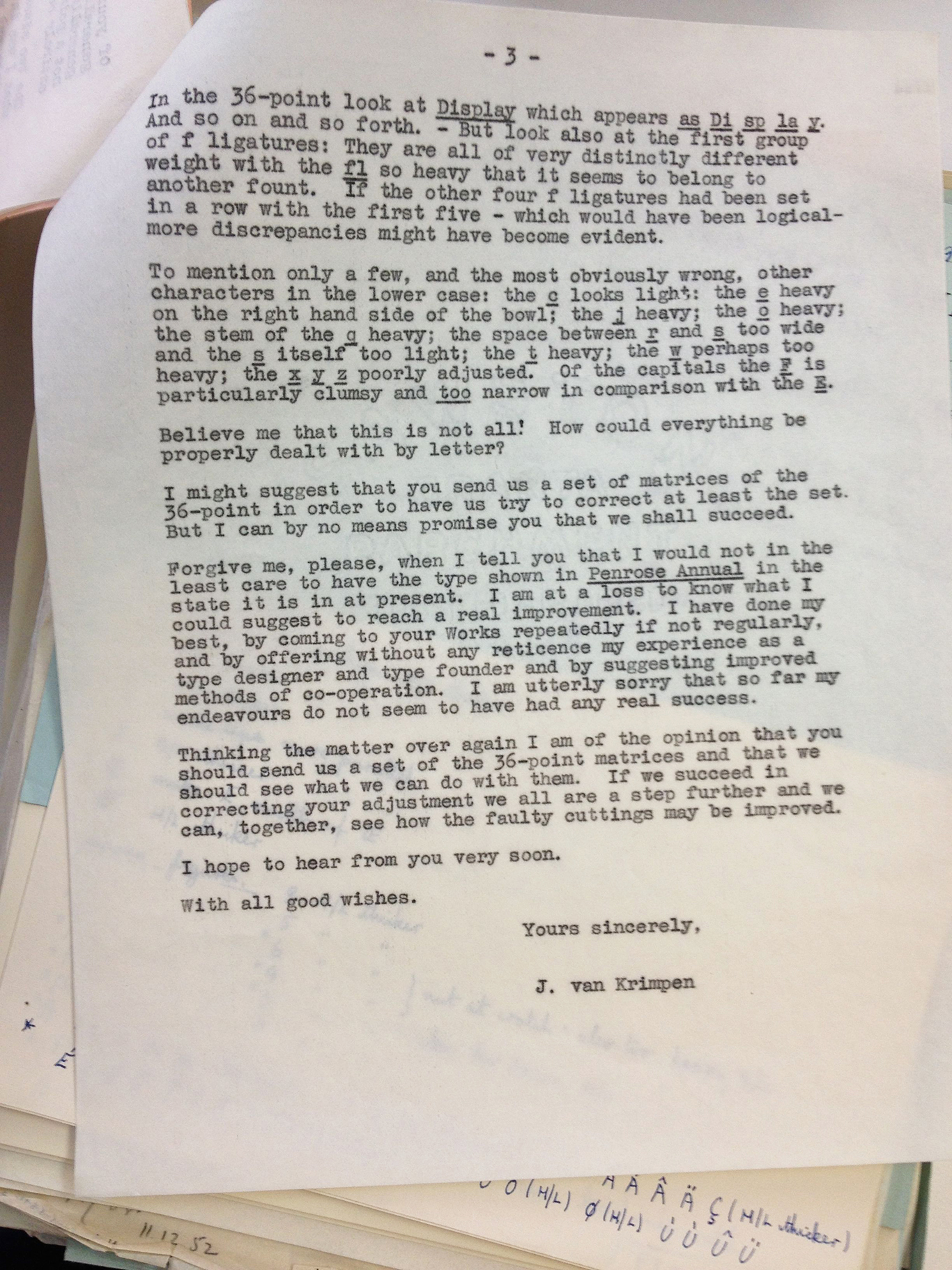
But if you thought the 16 point was bad, just wait for the 36 point.

Here is the proof of “Di sp la y”:
and that heavy fl ligature:

van Krimpen closes his letter this way:

“I am utterly sorry that so far my endeavours do not seem to have had any real success.” BURN.
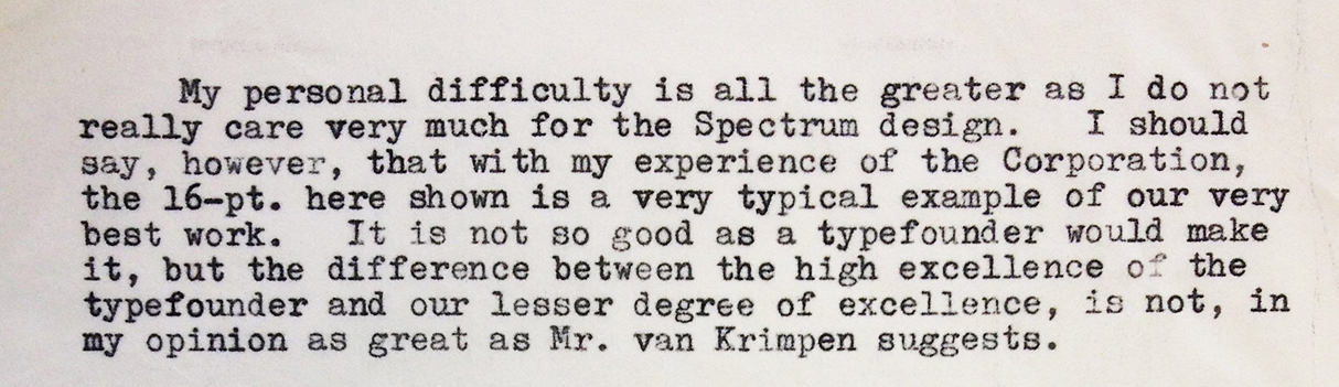
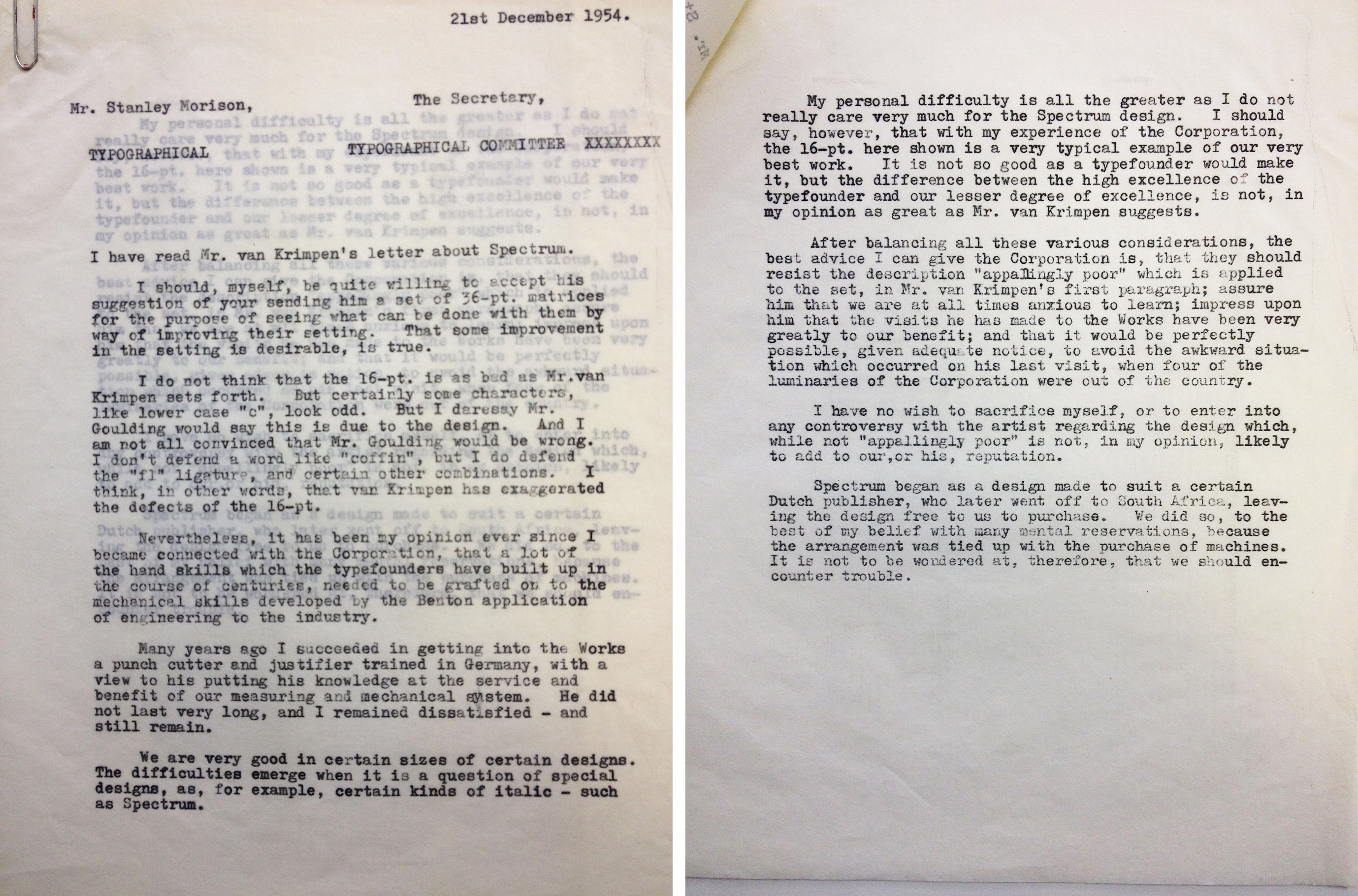
About a week later, on December 21, 1954, Stanley Morison sent a letter to the Monotype Typographical Committee (I believe this is a letter going back to Paulson) about Krimpen’s recent letter. In this piece of correspondence he is decidedly less positive about Spectrum than he was in that August 1953 letter to Krimpen when he referred to Spectrum as “a very good design.”
And then soon after:

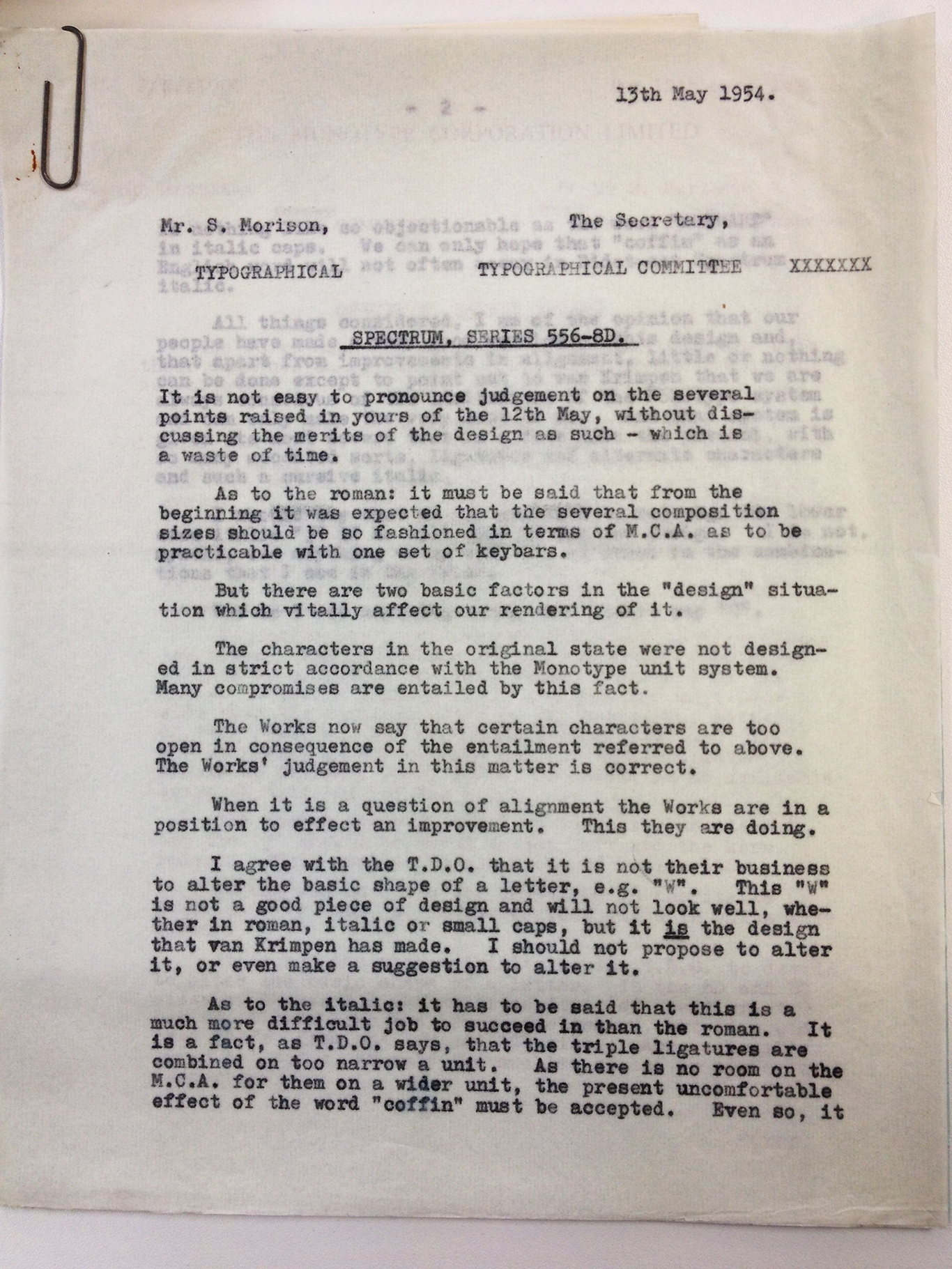
Well then. fine. He never even wanted Spectrum anyway. There are other letters that confirm Morison’s dislike of elements of Spectrum, including this earlier letter from May 13th, 1954 regarding the T.D.O (or Type Design Office) and its battle over a “W”.

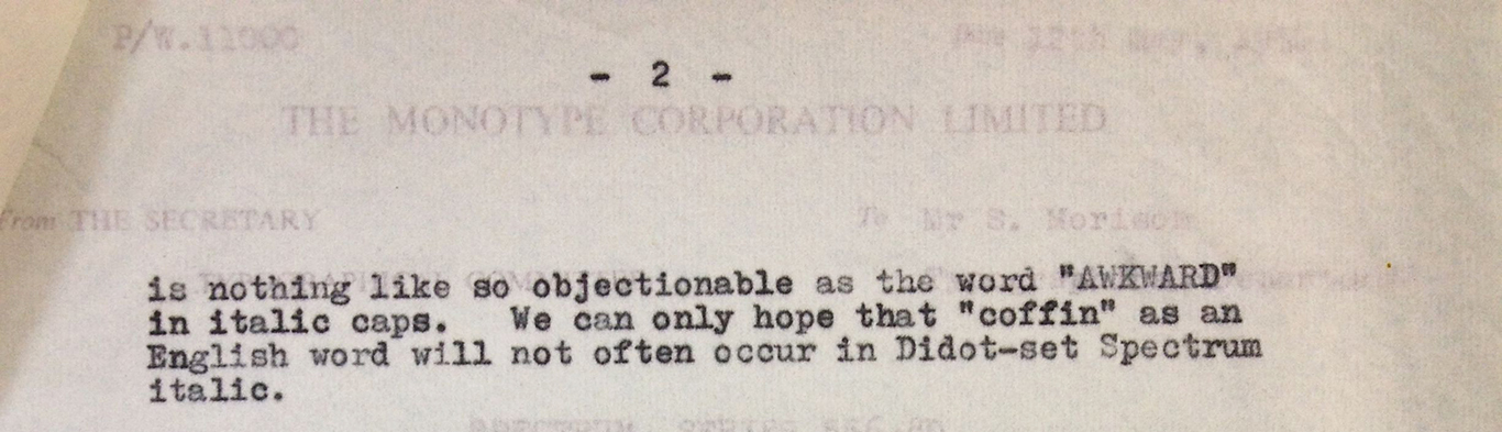
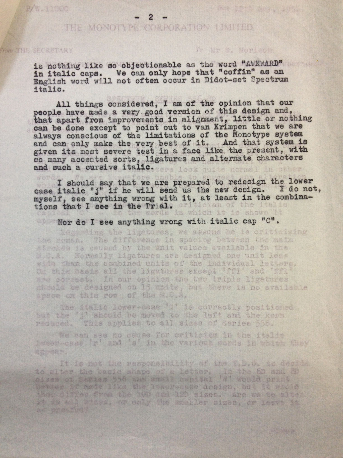
“This “W” is not a good piece of design and will not look well, whether in roman, italic or small caps, but it is the design that van Krimpen has made.” BURN. Immediately following this paragraph, Morison (a little hilariously if you ask me) suggests that because the ffi ligature has to be squeezed onto an uncomfortably narrow piece of type, there is simply no good solution to the “c o ffin” problem that we witnessed above, and that “we can only hope that ‘coffin’ as an English word, will not often occur in Didot-set Spectrum italic.”
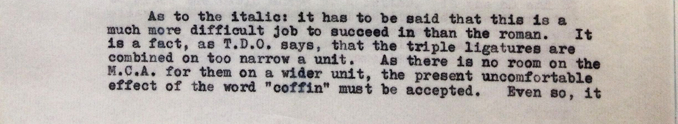
Ha! You are so funny, Stanley Morison. Actually there is a lot of interest in this letter. Morison lays out the challenges that Spectrum is up against quite simply. So have a read if you are as much of a geek as I am:
Spectrum was eventually released by the Monotype corporation in 1955 after dozens of such letters. The back and forth of design and production, laced with irritation, frustration, and the practical constrictions of a commercial enterprise, gives a fascinating insight into the world of mid 20th century type design. I am struck by the similarities between van Krimpen’s loathing of the Monotype system and the comments I’ve heard about the early days of digital type and the inelegance of pixelated letterforms.
Thank you Toshi Omagari, for being so generous with your time and showing me around the Monotype Archive. Very sincere thanks are also owed to Monotype for allowing me to spend time in the most interesting set of shelves I’ve seen in years. Thank you, Ben Mitchell, for helping me (sometimes a bonehead) understand the context of these letters. Any mistakes are mine mine mine.
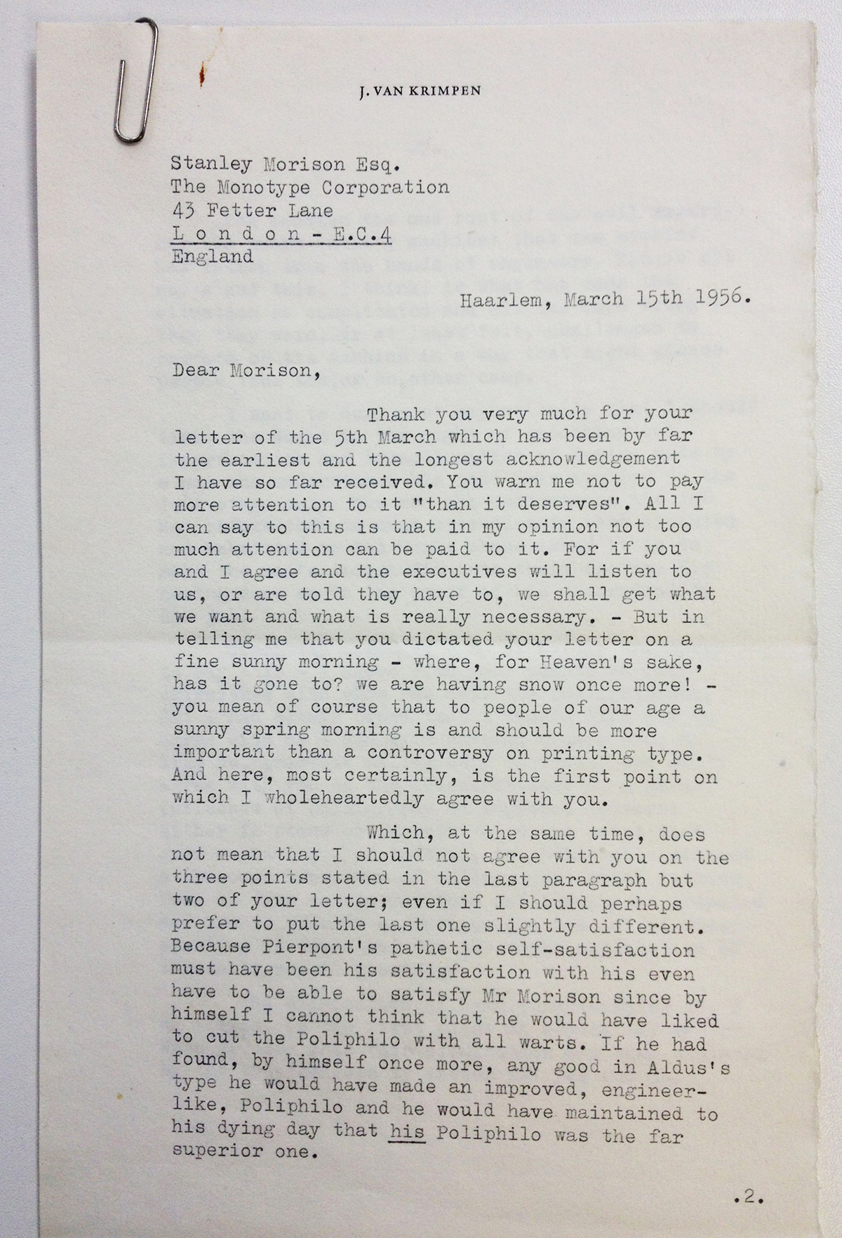
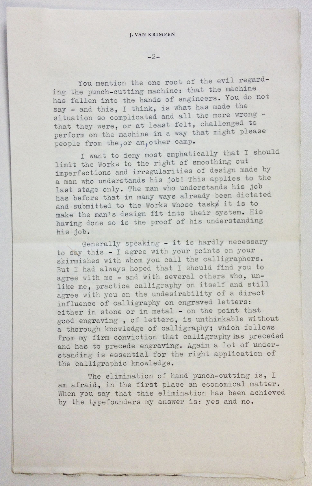
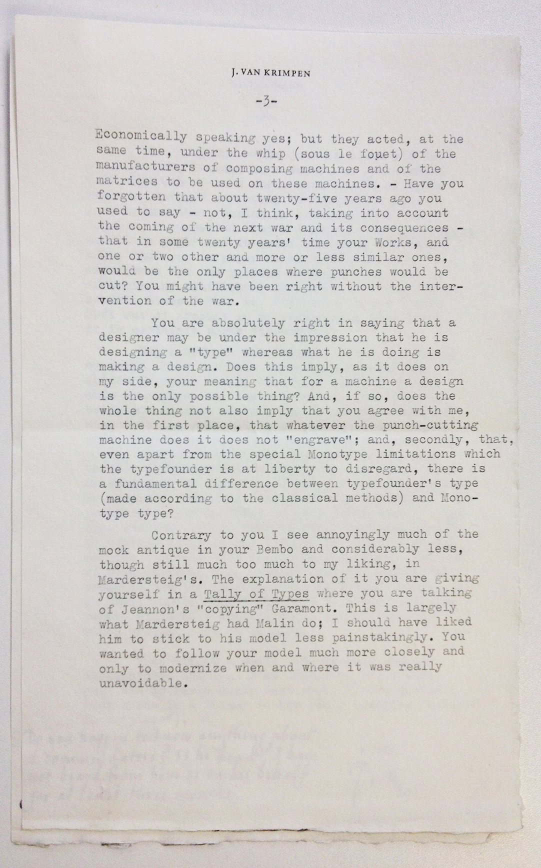
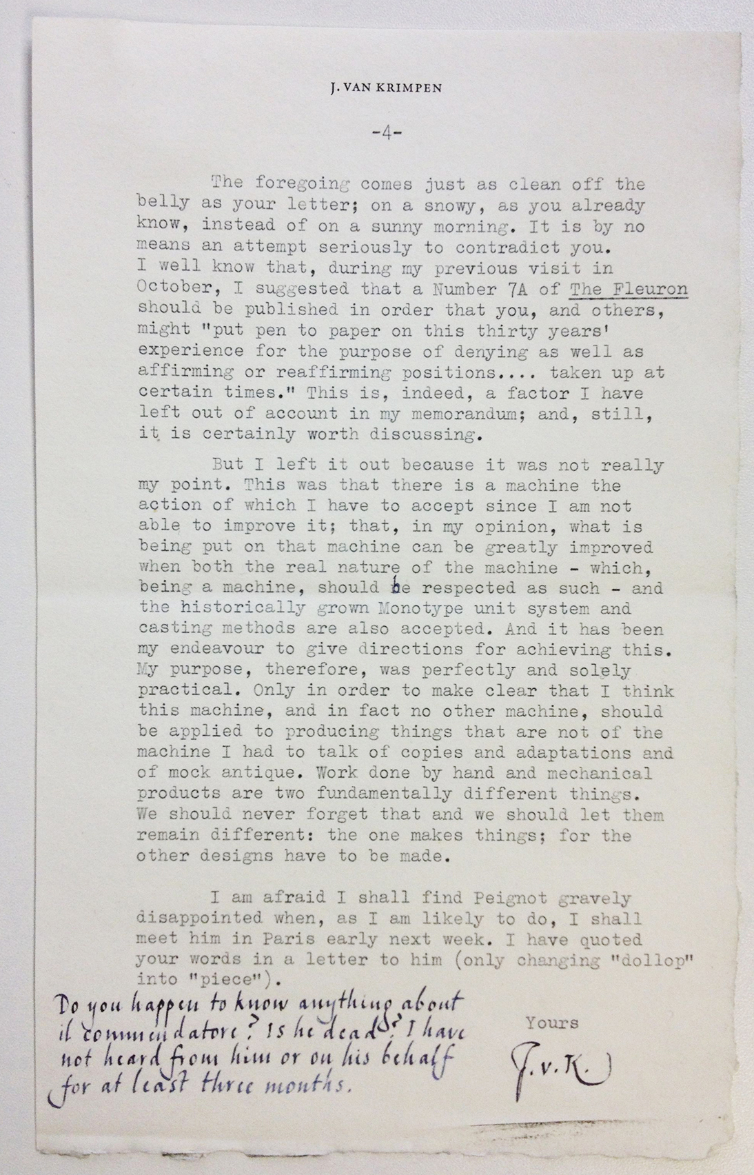
I will leave you with one of my favorite letters in its entirety, written by van Krimpen to Morison in March of 1956. I believe it is worth reading. At the end just before signing off, van Krimpen argues: “work done by hand and mechanical products are two fundamentally different things. We should never forget that and we should let them remain different: the one makes things; for the other designs have to be made.”
That’s all from the archive. Next week: more Big Jump Press action.
____________________________APPENDIX____________________________
#1. The complete August 25, 2953 letter from Stanley Morison to van Krimpen.
#2 van Krimpen’s December 14, 1954 letter to Geoffry Paulson, forwarded to Stanley Morison
#3 Stanley Morison’s December 21, 1954 letter to the Typographical Committee (Paulson?)
2 comments on “Adventures in the Monotype Archive: Jan van Krimpen’s Angry letters”
Leave a comment


Appreciating the hard work you put into your blog and detailed
information you present. It’s good to come across a blog every once in a while that isn’t the same out of date
rehashed material. Wonderful read! I’ve saved your site
and I’m including your RSS feeds to my Google
account.
Thanks so much for reading and I am so glad you found it interesting! My trip to the Monotype archive was a highlight of my year. I am hoping to get back eventually. So much to see there! Best wishes to you and thanks again,
Sarah