
Enter the Type Designer
Hey, you know who’s interesting? My friend Ben Mitchell. Look at that desk for god’s sake. Ben is a type designer, and so his flat is a dangerously geeky place to be. check this out:
 That is a manicule taped to his wall. Before I knew Ben, I used to call this a “pointy hand,” but no, it is a manicule. In fact, this one is Ben’s manicule, a manicule he designed his very self. Oh yeah, and look over here:

This is the kind of awesome business that Ben has on his fridge. Look what he’s reading these days:
 Oh, obviously! It’s Taro Yamamoto’s A Natural History of Printers’ Flowers. Duh. It lives here with Ben’s other books:

It was around this point, as I was lying down on his floor trying to get a great shot of the bottom of his bookshelf, that Ben begged me to please stop taking pictures of his flat (or “natural habitat” as I was calling it in my head) because it made it difficult for us to have dinner. I agreed, but on the condition that I ask him a few questions that I could put on the internet. So here we are!
Hello Ben! What is your definition of a type face?
That’s actually a very pertinent question as it doesn’t have a straightforward answer. A typeface is a tool for reproducing written words in print. A typeface gives shape and style to the words we read, a ‘tone of voice’ for writing. A typeface is what happens on the screen when you press a button on your keyboard or smartphone. A typeface is a piece of software that composes text into nice, readable sentences and paragraphs. A typeface is an idea of how a writing system looks, an instance of artistic and political expression.
Can you please explain the difference between a ‘typeface’ and a ‘font’?
Strictly speaking, a ‘typeface’ signifies a design — the way an alphabet is drawn — whilst a ‘font’ is a piece of software, a file that you use on your computer (and there are different font files for the regular, the italic, the bold, and whatever else there might be). So for instance, there’s one typeface called ‘Comic Sans’, a design created by Vince Connare, but everyone with Windows has a copy of the font.
It’s an important legal distinction for type designers as most countries protect font software in copyright law, but the design, essentially a group of shapes, cannot be protected legally. That’s one reason why you might come across different versions of typefaces.
I imagine you often meet people who ask you why we need any new typefaces in a world full of old ones. What is your answer? Why are new typefaces important?
I guess there are two main reasons, practical and aesthetic. Practically, a typeface needs to work in certain environments with particular technology. Think of all the places we read words! We couldn’t use metal type from Gutenberg’s era to send emails. In the same way, we need different kinds of typefaces for television, internet, newspaper, motorway signage, washing machines, scrolling displays in buses and trains and chapters of printed books. The text in those environments has to work in a different way and achieve a different aim. These days, typefaces have to perform in an ever-broadening array of environments, especially with new hand-held devices and the possibilities of using different fonts on the web.
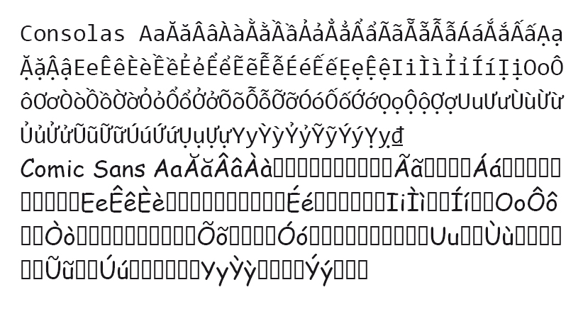
There’s also the related question of what languages a typeface supports. If I want to write in Vietnamese, I can’t use Comic Sans, for example, because it doesn’t have Vietnamese letters:
Aesthetically, if a typeface is a tone of voice, different media require a different tone of voice. If you scaled down the typeface from a motorway sign and used it to set Lord of the Rings, it would be a very unpleasant reading experience, as the tone of the letterforms would suggest ‘public information’ rather than ‘classic storybook’ (In scientific terms the motorway signs are aiming at instant legibility, the storybook needs to focus on immersive readability). A typeface is like the clothes a piece of text wears, choose the wrong outfit and the text will be uncomfortable. So although there are hundreds of thousands of typefaces, there’s often not the exact one you need or want.
I guess in some ways it also comes down to the reason why architects design new buildings rather than copying the old ones, why musicians write new songs or why furniture makers design new tables and chairs: because it’s a natural human desire to take things in new directions.
For those of us who are not type experts, can you give us the basic anatomy of a letter?
This is easiest to answer with an image*, (which you can click to enlarge):

* There is a lie in this image, but it is not the word tittle. Can you find it? I bet you can.
Ummm, no way is the dot on the i called a tittle. You are lying.
I am not lying, you butthead.
You are the butthead.
no, you are.
Enough of this. When designing a typeface from scratch, where do you begin? A letter, a form, a drawing, research?
Like all good design, you start from a brief. What is the typeface being created for? Is it meant for small sizes, huge billboards, extended reading, corporate branding, multi-lingual publishing or screen use? I’d then think about how that environment might have certain requirements, and then try to convert those into a practical framework for drawing letters. For example, a dictionary or newspaper needs rather small text and many different styles like bold and italic. Small text needs to have quite a dark weight and quite open spacing between letters. To get the most words on a page with widely-spaced letters, the letters can be drawn slightly condensed. Often these factors interact, and that’s what determines the final look of a typeface.

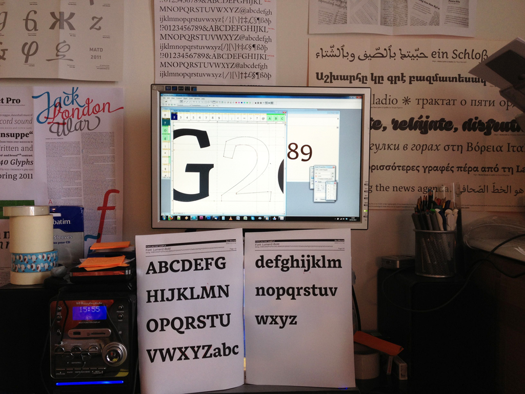
Very early sketches for Lumen, a dictionary typeface
I’d start sketching ideas with these factors in mind, usually starting with the letters n, o, d and a, as these give the main kinds of repeated shapes you need to build the lowercase alphabet. Once I’m happy with a few pencil sketches, I’d start digitising, build a few more letters and then run a lot of print tests.
Which aspects of a design must carry from character to character to create a cohesive type face? What aspects of a letter allow for divergence or flourishes that are slightly different from the whole?
What works in one typeface won’t work at all in another, so there’s no way to generalise. The paradox is that every letter must be adjusted to fit with every other letter, but of course each letter has to look like itself. Type design is an iterative process: after drawing an /a/ and a /d/, I realise I need to change my /n/. That might mean changing the /h/ and /m/ and /u/, and those changes will have many, many other impacts. It’s often been said that type design is an endless loop: the more time spent on it, the better the results, but there will never be a ‘perfect typeface’, it’s just a case of the designer not being able to devote any more time to it.
A decent typeface simply takes a lot of time. The designer needs to make sure all letters have a similar optical density (no ugly heavy or light letters), even spacing, and a way of evenly spreading out the character of the typeface throughout all the letters (you don’t want all the personality in a goofy /g/ when everything else is sober). That needs experience of what it means to give a typeface character. Having said that, the /g/ can be more expressive than other characters, as its shape is unlike anything else in the alphabet. Ampersands (&) or zs often have more exuberant flourishes, especially in the italics, as they’re uncommon and won’t disrupt word recognition too much.
You tend to design text faces, rather than display faces. What shapes your interest there? Are you at all interested in display type?
You’re right, it’s funny, I was wondering the same thing myself a couple of weeks ago. I think there are more interesting questions to be solved in designing a text face. In text faces, you are concerned with performance, how the letters work together, how a word reads. The hundreds of tiny decisions you make about the types of curves you use, the size and shape of the serifs, the way stroke junctions are formed, all these tiny decisions are repeated hundreds of times on a page, and the en masse effect of that is to give text a particular voice or feel. You’re thinking about regularity, readability and the texture of a paragraph, very practical considerations, somehow much more detailed than making a display typeface, and more rewarding. In The Making of Garamond Premier, Adobe’s senior type designer, Robert Slimbach says: ‘For me, text typefaces represent the most sublime expression of our alphabet — the best examples possess a grace and balance aimed at serving the utilitarian needs of readers’.
Display stuff is fun too, it’s there to look stylish and make an impression, so there’s a lot more freedom in how you draw letters. I guess I’m more drawn by functionality than by showiness and expressiveness. A text typeface can be used for a lot more things than a wacky 3-D techno mashup. But I do really admire the way certain designers are able to make typefaces that have a lot of personality but are still widely useable. I’m thinking of the recent Landmark typeface by Hoefler & Frere Jones, or Commercial Type’s Dala Floda.
I know you are working on a revival of Emerson at the moment (because I was there when you saw it for the first time, which makes me a collaborator and therefore deserving of whatever profit you make.) What makes that typeface particularly interesting to you?
Hoo! I don’t expect there’s going to be much profit to share. It’s more a labour of love, that one.
I don’t care. I want the money anyway. Now go on.
It’s a funny old beast from 1930, which strikes an interesting balance between rugged and elegant, between sober and warm. I like it because it really feels as though it comes from a different era; it’s a bit quaint and has a sort of old-fashioned storybook feel about it, the sort of design that people don’t really tend to make these days, an evolutionary dead-end abandoned to history. There was really only one weight (the regular) made in metal (I’m not counting the nasty italic), which means there’s a lot of juicy design decisions to be made in a revival: What can I bring to it to make it really useful to typographers? How would a bold look? What can I do with that nasty italic? What sort of typographic symbols or ornaments would be historically suitable to go with that design? I’ve been researching it on and off for about three years, so it’s combining historical research with practical questioning, testing and a lot of thinking and self-critique, an enjoyable experience all in all.

Specimen of Spiral, the foundry metal precursor to Emerson
You are establishing yourself as an expert in Southeast Asian typefaces; Can you describe some of the challenges of transferring design elements from Latin faces into these scripts? What are the particular challenges in doing so with Burmese, for example, and how do those challenges differ from issues you encounter with Thai?
Oh, that is definitely one of the important discussions among type designers. Certainly some designers transfer elements from one script into another, but you have to be very careful that you’re not importing something alien into a writing system. There’s a lot of debate over ‘Latinisation’ of world scripts these days, and people get sensitive about cultural imperialism. The way I avoid that trap is to find adjectives that describe my Latin design, and then use those adjectives to come up with harmonious letterforms for the other scripts (and it works the other way too). Or I might look at my Latin and think, ‘oh, that has quite light junctions’ and see how that can transpose onto another set of shapes. But still you have to be careful. The best way to get in tune with a writing system is to immerse yourself in the culture that uses it, and I was lucky to live in Thailand for several years, so I got a daily familiarity with all styles of the Thai alphabet. That’s not always possible, so the other way to approach it is through research. For Burmese I researched the traditional milieux of Burmese writing, tracing its evolution back through the centuries by looking at palm-leaf manuscripts and inscriptions to see how the forms ended up the way they look today. That insight and exposure to a writing system gives a lot of clues how to approach a new design.


Can you explain the importance of designing a face that has Latin and Southeast Asian scripts which work together?
Well, I can illustrate that with the case of Burmese. Burmese typesetting is made very difficult because there are only a handful of fonts available, and most of those either don’t work consistently on different computers, or are really badly drawn. Compounding the problem is the fact that there have been *no* fonts that combine Burmese and Latin by design, so if you’re for example a dictionary publisher, you can’t achieve a nice, harmonious page because you have to use a Burmese and a Latin that have different sizes, different densities and different textures:

Clashing font styles make an unpleasant reading experience
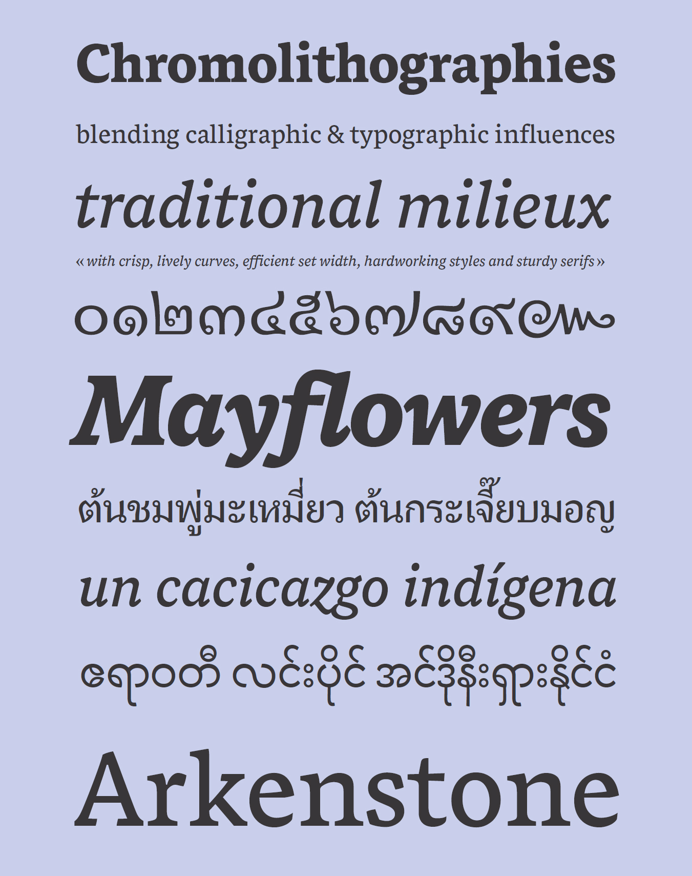
My typeface, Lumen, was an attempt to remedy this situation by making the two scripts look like they belong together, rather than fighting each other on the page.

Lumen aims to harmonise font styles across three different scripts
Oh, yes, please tell us about Lumen. [by the way, everyone, here is a link to the specimen sheet so that you can see Lumen in more detail. It is an interesting read full of photos.]
Here is the blurb that I use for my specimen sheet: Lumen is the product of a year’s study at the University of Reading. It is unique among typefaces in both its scope and its design, taking influence from historic models but equally at home splashed across the pages of contemporary editorial design or set in continuous prose in book design. With its unparalleled support for Burmese, Thai and Latin all conceived together from the outset, Lumen is the first typeface to integrate the three scripts in complementary, stylistic harmony whilst respecting the different heritage of each. It is also fully Unicode compliant, a rarity among Burmese fonts. Lumen’s character set and range of styles are rooted in the practical needs of complex and hierarchical typography, such as dictionary, editorial and textbook usage.
The design process has been a journey into the past to rediscover the vitality of Burmese text, a journey into complexity to figure out how to translate Southeast Asian writing systems into OpenType code, and a journey into the tiniest details of letterforms and spacing to optimise text typography. At the same time, Lumen stands for a brighter future for the peoples of Burma and their new opportunities for democracy and international dialogue, in which the worlds of communications, publishing, design and web can support and encourage permanent change.
You’ve just completed your MA in Type Design at Reading University. What did you take away from that experience?
The thing Reading does really well is it contextualises your practice in 500 years of printing history, so you’ll be handling all sorts of printed artefacts and looking at a bit of their historical context: what were social and technological conditions at the time and how did those impact on how words could be presented. Reading’s approach focuses on critical thinking and research skills. The critical thinking part means you think about how the choices you make in your work have a bearing on how well your project addresses its brief. The course doesn’t give you recipes for making a nice typeface; instead it develops your eye for detail so that you know what questions to ask yourself when looking at type critically. The research element gives you an approach you can then use for unfamiliar topics. For example, If I’m asked to do a Khmer typeface, from my studies of Burmese, I know the sorts of resources that will be handy, what to look for in them, the kinds of people who can advise, and I’m able to assess the strengths and weaknesses of existing typefaces.
Is there a particular letterform that you really enjoy designing or one that you are particularly proud of?
I enjoy the ones with lots of tricky curves most of all. Things like the ampersand (&), the two (2), the at-sign (@) and the lowercase g (g). Those are quite rewarding when they finally fall into place. I usually leave vwxyz until last. They’re troublemakers, boring to draw, actually not very straightforward, don’t fit with the other letters, and always feel just a bit unnecessary.
You probably just think that because you don’t have any of those letters in your name.
ok.
Your go-to desert island top five typefaces?
Oh dear! I’m not really someone who uses a lot of typefaces! It’s a shame because different typefaces need to be used in different ways, and that teaches you a lot about how they work. If I list my top type designers, they’d be Kris Sowersby (KLIM Type Foundry), Joshua Darden (Darden Studio), Paul Barnes & Christian Schwartz (Commercial Type), Iñigo Jerez (Textaxis) and Hannes van Döhren (HvD Fonts). What I really admire is the way designers like these can get inspired by old lettering or historical typefaces and create fresh ideas that don’t really look like anything else. Their work is polished, and can be simultaneously utilitarian and full of personality.
I love reading books set in Plantin or Stone Serif. The rhythm and warmth of those designs makes reading a pleasure.
Your never-ever, you’ve got to be kidding, keep that shit away from me typefaces?
My main problem with typefaces is when they gain too much popularity and end up getting used for things they shouldn’t.
In the last few months, I’ve noticed a lot of ITC Kristen on pub menus; you’ve probably seen it too. Perhaps the message about Comic Sans being unsuitable for anything other than childrens’ comics has finally got through to the people who design these things. But the thing is, Kristen is not really an improvement because it’s still a typeface made to look like an infant with a felt-tip pen. I guess the pub managers want to convey ‘proper’ food that’s not too fancy or sophisticated, or a relaxed, lively atmosphere, but it just looks like a noisy kindergarten.

gross
Don’t be ridiculous, type designers don’t sleep.
[end of interview]
Just for the record everyone, I have seen Ben’s pillow, and here it is:

Depending on how things shape up, Dave Allen and I may be using one of Ben’s typefaces for our new book. Next up for me? America! I fly to Philadelphia on Tuesday morning.
14 comments on “Enter the Type Designer”
Leave a comment


I love the manicule, I wonder how many other interesting names there are for things we don’t usually need to name.
Agreed! It’s my favorite new word this week.
A*nastasia, N*obody U*nderstands S*tuff like you do.
You got it, Glenn!
Seriously Sarah and Ben. Put this blog into a chapbook. All your blogs, Sarah.
Fascinating blog. I learned a few things here – other stuff I didn’t learn because I am not that smart. Somehow “anus” does not strike me as proper for a font attribute.
Thanks Judy! I am glad you enjoyed this. I love how articulately Ben explains his work. And then, of course, there is the word anus. You are right, it definitely does not belong.
All points of character description are based on the human body, as area ll facets of publishing — hence, spine of a book — so, there is historical precedent. What is a better term? Pore? Pimple waiting to be attended to 😉 Dimple!
sorry about that typo — ” as are all facets …”
I love typefaces, and I am in awe of the creativity that goes into designing them! This was a great read.
Thanks, Fiona! I am so glad that you enjoyed it. I love talking to ben and hearing all of the details that I know so little about, knowing that they are relevant to all of my reading.
Great post! So informative, and even for a neophyte like me, so fascinating and much fun to read!
Thank you Sarah.
I am so glad you liked it! I am also a neophyte as far as type design is concerned. Thanks so much for reading!
Just found and read it today. This post is so informative to me to understand more about the typeface design. Sure, I enjoy reading the interview with type designers. And this kind of information gives me more ideas for my future research on Khmer Typography. Thanks.